Analyse and Explore your Data with Explorer
Set the context of the analysis
The functionalities allowing you to choose your perimeter of analysis (sites and periods) are located in the upper banner.
Selecting sites
The first drop-down menu allows you to select a site, several sites, or a level 2 site. The search engine integrated in the drop-down list (1) allows you to access the sites you wish to use more quickly.
To select a site, click on its name (2).
To select multiple sites, click on the corresponding checkboxes (2) and then click on the "OK" button.
A summary of your selection is available via the link at the bottom of the drop-down list (3).
On the overview screen you can view the list of selected sites, modify your selection by deleting one or more sites (1), reset your selection (2), or return to the list of all sites (3). You will then have to re-select at least one site for new data to be displayed.
When you select multiple sites, a "save" button allows you to save your selection as a group of sites. Once at least one site group has been created, you can find, edit or delete it from the "groups" tab (1).
Notes
The default site used will be the same as the one specified in the personalisation of your account.
Period selection
In the second menu (1) you can select the period to be analysed.
Numerous shortcuts allow you to select a specific analysis period with one click without having to configure it manually (current year, current quarter, current day, etc.) (2). The scan period can also be manually configured with a start and end date entered in a calendar (3).
Comparison period
It is possible to compare the values of the current period with those of a past period. To use this feature, you must enable the "Enable comparison" option.
By default we compare the data of the current period with those of the previous period. It is possible to customize the comparison period. This option is available in the calendar :
The comparison values will be visible on the curves and indicators of the "Preview" analyses, on the histograms (grey bars), as well as in the tables of all other analyses.
Real time / current day
You can study the evolution of the data of your site or application on the current day. To do this, select the shortcut "Today" (1) in the period selector. The analyses will be refreshed and will cover the whole day, up to the last minute of available data. Please note, for your navigation comfort, the data are not automatically updated. If you wish to refresh them, you will have to click on the "refresh" button (2).
Notes
It is not possible to combine data from the current day with data from previous days in the same analysis.
Anatomy of the analyses
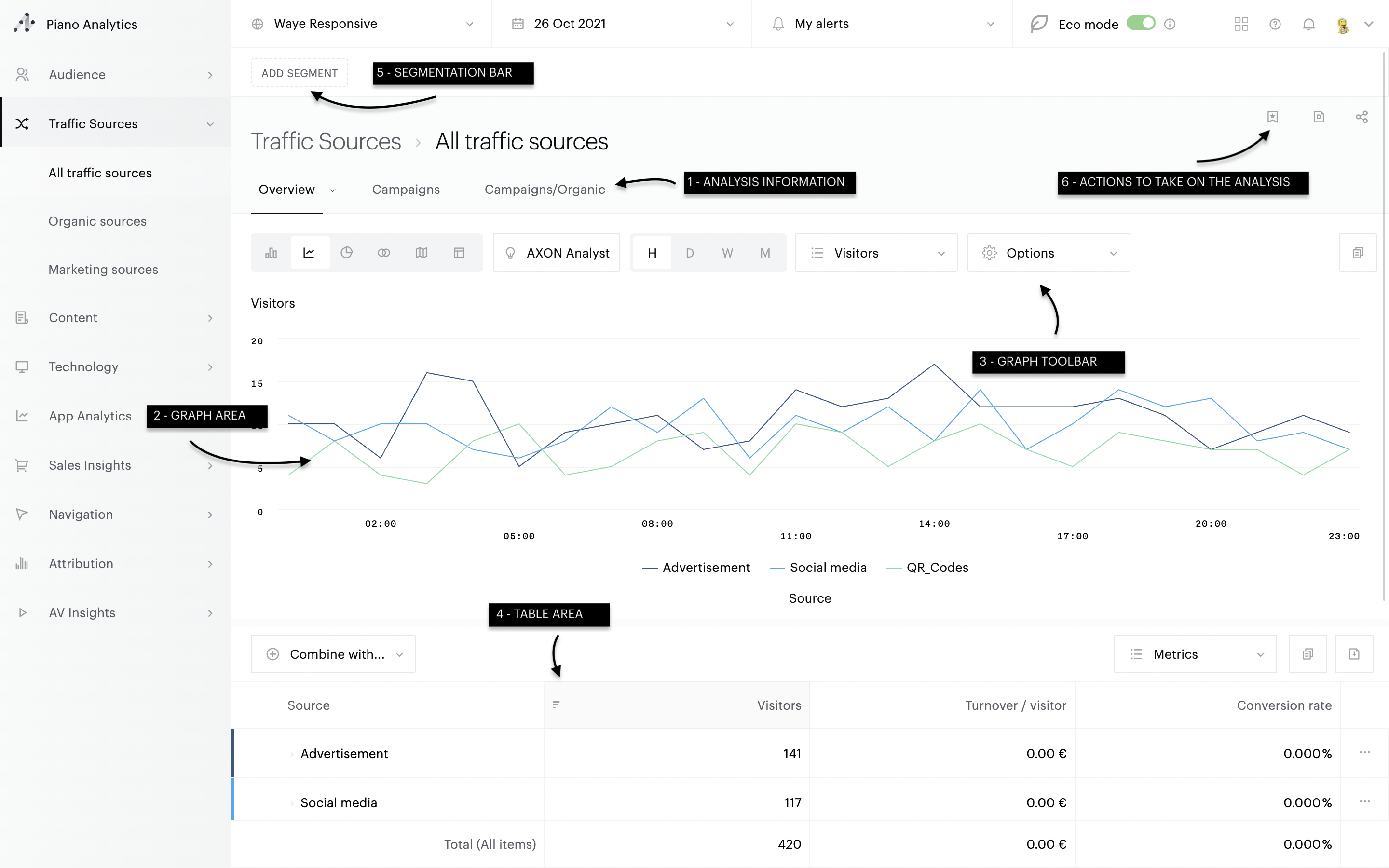
The vast majority of the analyses are as follows:
[1]: Analysis information
[2]: Graph area
[3]: Graph toolbar
[4]: Table area
[5] : Segmentation
[6]: Actions to take on the analysis
Analysis tree Explorer
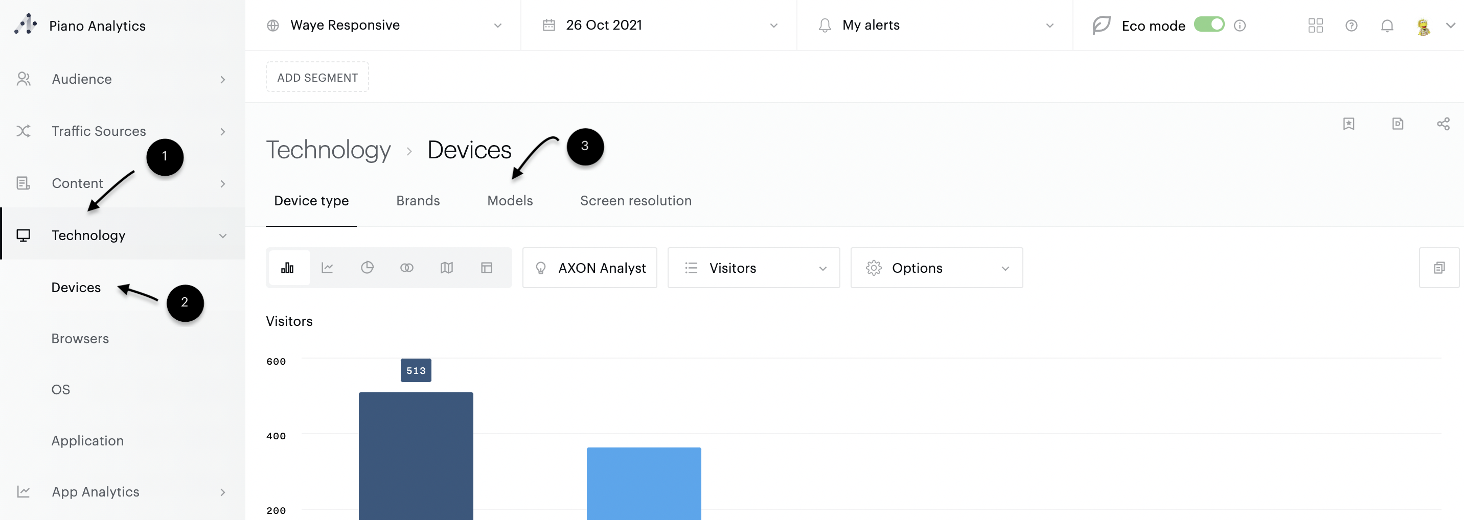
In order to guarantee quick and easy access to the data, Explorer offers only three levels of tree structure: family of analyses (1), analyses (2), sub-analyses (3).
Information
The URLs used in Explorer allow direct access to analyses in the context of your choice. However, these URLs may change in the future. Therefore, we do not recommend bookmarking them, but rather creating customised views.
Working with graphs
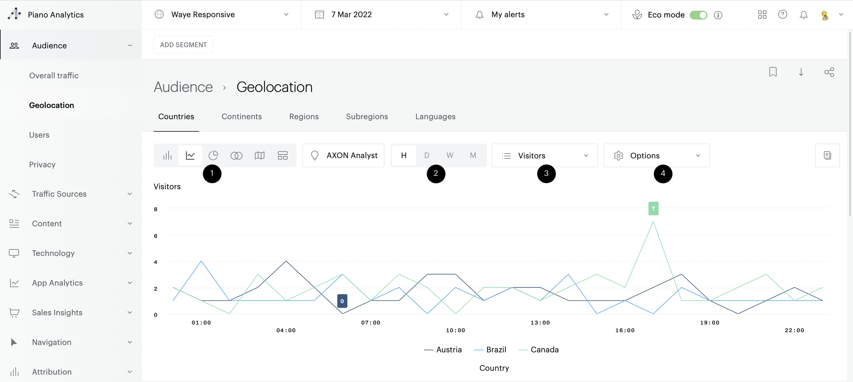
Each graph has a toolbar. From this toolbar, it is possible to
Changing the type of graph (by default, curves are proposed) (1)
In the case of curves, change the granularity (2)
Select the metric to be used in the graph (3)
Enable / disable options, depending on the type of graphic (4) :
Histograms: switch to horizontal histograms
Curves: show / hide min & max, average, trend, enable / disable graph comparison, enable / hide event log display
Pie chart: show / hide the "Others" part
AXON Analyst: show/hide anomalies, trend, baseline and prediction
Working with tables
Headers
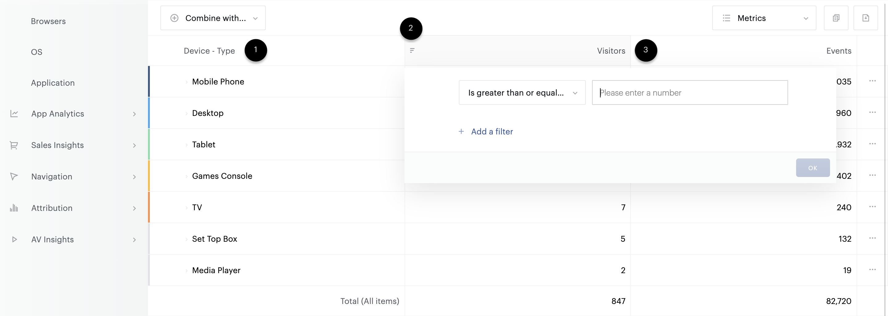
In order to facilitate the understanding and analysis of the data, the definition of each element (properties, metrics) in the table is proposed when hovering the mouse over the element's name (1). Each column can be sorted (it is not possible to sort several columns at the same time). The type of sorting as well as the filtered column are highlighted via an icon (2).
Filters can be applied to the elements of each column and can fulfil several OR, or AND conditions. Each condition must contain a filter criterion (strictly superior, superior or equal, equal, inferior or equal, ...) (3)
It is possible to combine filters from several columns.
By default, only the most commonly used metrics are displayed. Additional metrics can be displayed - or hidden using the "Metrics" button at the top right of the table.
Values
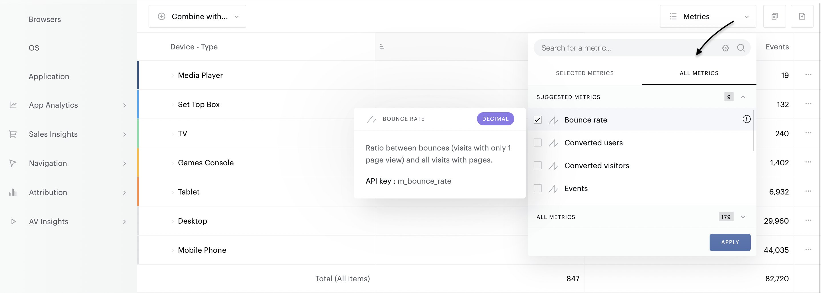
The values in the table are sorted by default on the first metric in descending order.
Drill down
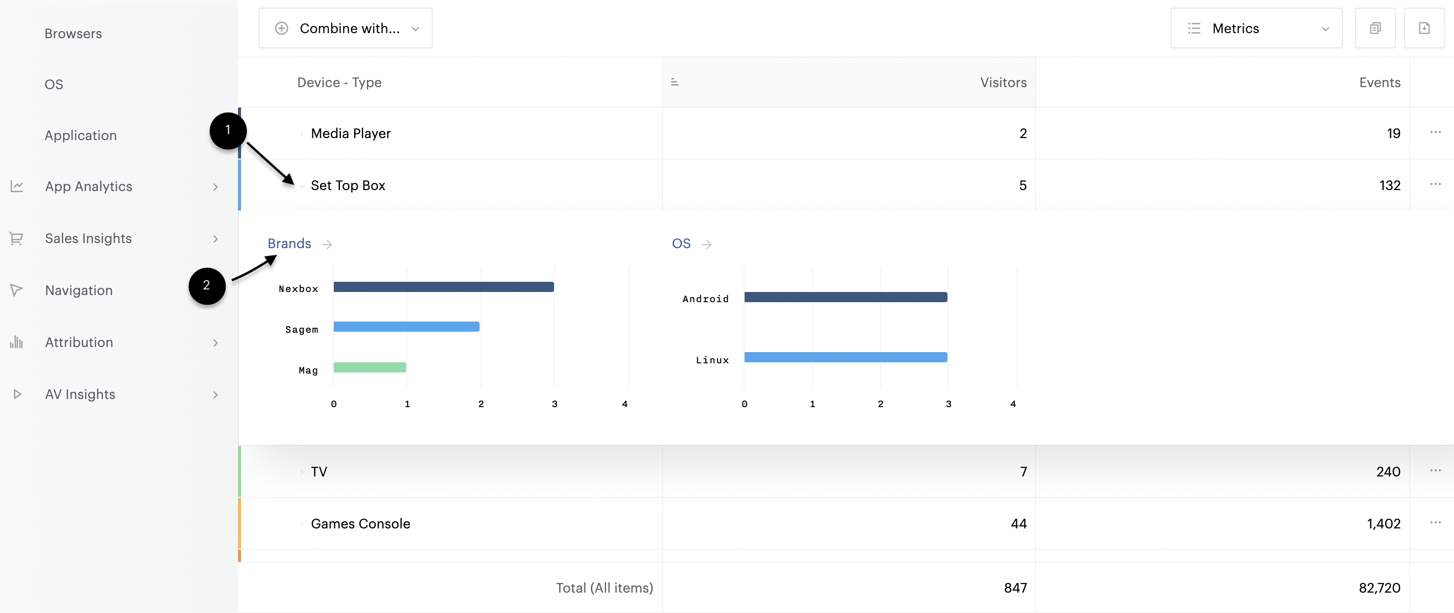
Some scans allow you to access additional information without having to reload the screen. This drill down functionality is materialised by a chevron, preceding each entry in the table (1). To activate it, simply click on the chevron. The drill down allows up to 3 sub-analyses to be displayed. For each one, we propose a top 5 of the elements in terms of visits (this metric is likely to change according to the analyses).
If you wish to obtain the complete list of elements, click on the title of the drill down (2).
Combinations
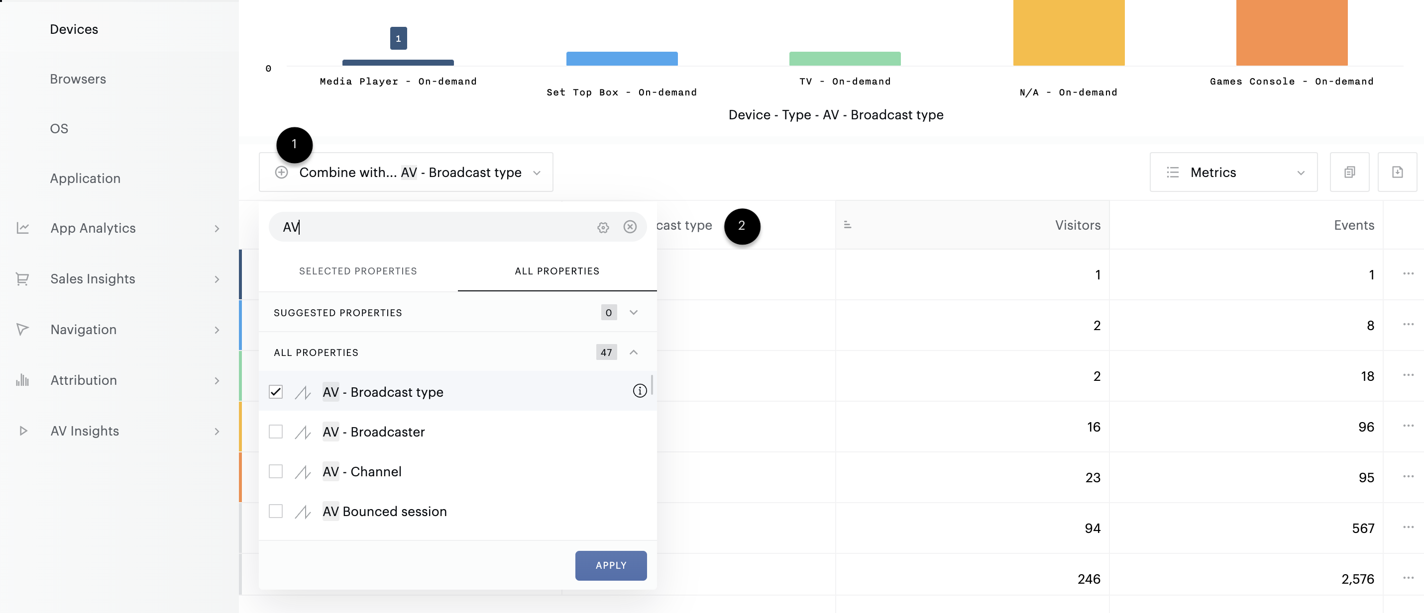
To go further in your analysis, you can create cross-combination of data. To do this, click on the "combine with" button (1), then select the property on which you wish to combine. A new column is added to the table, with the property you have just added. You can add up to 3 properties in addition to the standard one in the analysis.
To delete a combination, reopen the menu and deselect the items.
Notes
The "total" line shows the sum of all the elements of the analysis and not the total of the displayed elements.
Updating the graph
The chart area can be manipulated from the table. It is possible to choose the elements to be displayed or hidden from each line. The interaction can be managed in two ways, depending on the needs:
1/ By clicking on the block at the beginning of the line. If the block is coloured, the line concerned will be displayed in the graph. If the block is in black and white, the line concerned will not be displayed in the graph.
2/ By selecting the elements to be displayed in the graph and then on the "Replace the items" button that appears at the top of the table. This action allows to "override" the elements of the graph and to replace them by the elements of the selection.
Specific analyses
Audience loyalty analysis
The Audience loyalty analysis provides a very interesting perspective into how and when your visitors return to your brand's various websites and applications following a visit made on a given day. Using this analysis you will be able to instantly visualise the proportion of visitors that have returned to your site and in which timeframe.
The Audience loyalty analysis is available for the following timeframes:
Période d'analyse | Granularité |
7 derniers jours | Jours |
14 derniers jours | Jours |
4 dernières semaines | Semaine |
14 dernières semaines | Semaine |
3 derniers mois | Mois |
6 derniers mois | Mois |
Example: With the following retention analysis:
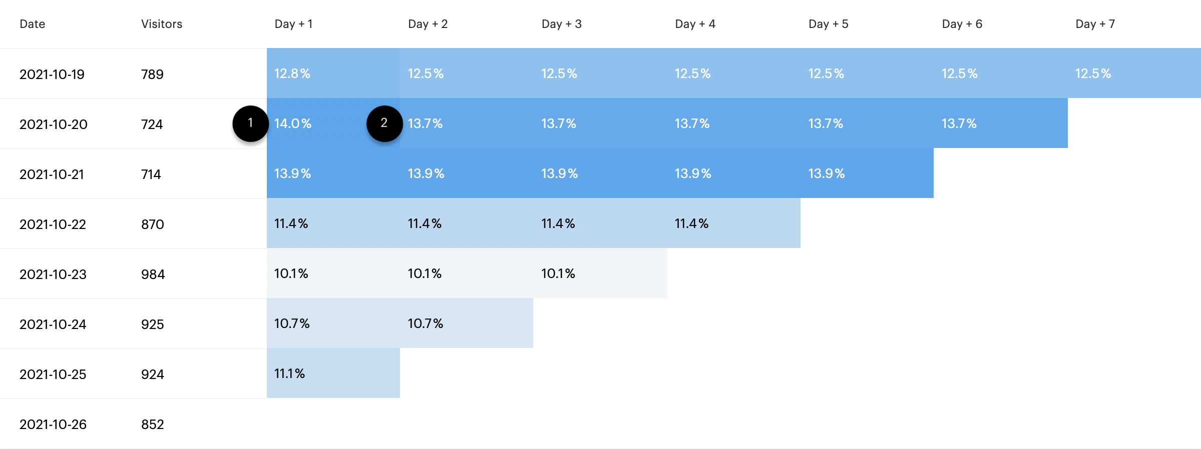
The results should be read in the following way:
(1) 724 visitors visited the website on the 20th of October 2021
(2) 14.0% of those visitors returned on the following day
(3) 13.7% of those visitors returned 6 days later
Venn Diagram Visualisation
The Venn Diagramme visualisation provides a very interesting perspective into the cross over between two elements. Using this visualisation will enable you to instantly visualise user behaviour across many properties.
Example: With the following Venn Diagramm on users' devices:
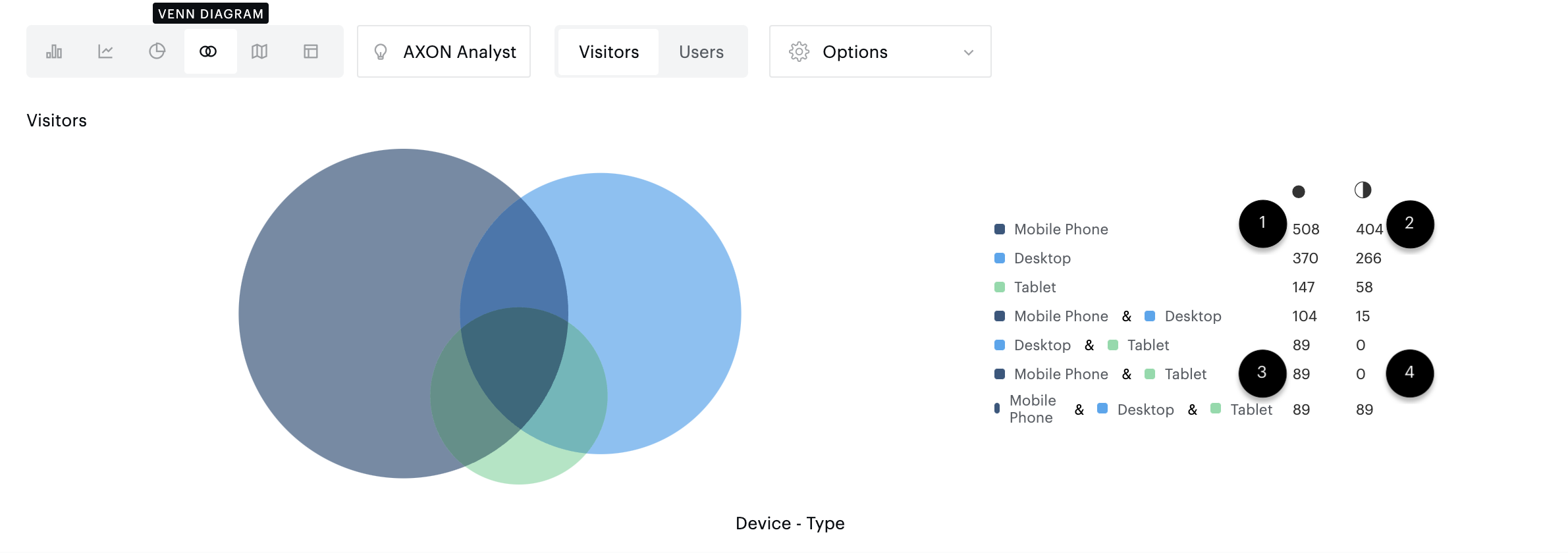
The results should be read in the following way:
(1) 404 users reached the site exlusively via mobile phones.
(2) 508 users reached the website at least once via a mobile phone.
(3) 89 users reached the site exlusively via mobile phones & tablets.
(4) No user reached the website at least once via a mobile phone and a tablet.
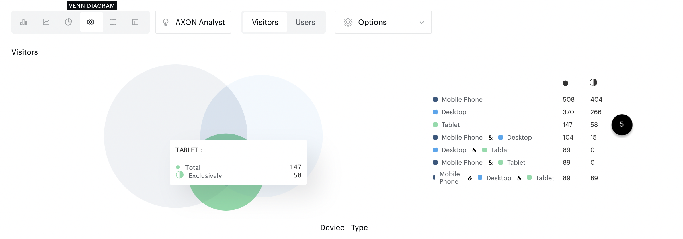
(5) The Venn Diagram will highlight the corresponsing area when you hover over a specific element with your mouse. In this example, the area highlighted in green represents the user that reached the website exclusively with Tablets, excluding cross over with mobile phones and desktop.
Segmentation
Create a segment
Each analysis can be segmented according to the criteria of your choice. Segments can be created or selected from the "Segmentation" bar.
To create a segment from the segmentation bar, click on the "Add a segment" button (1). You will then have the possibility to create a segment on the fly, or to apply a segment previously created in Explorer or Data Query (2).
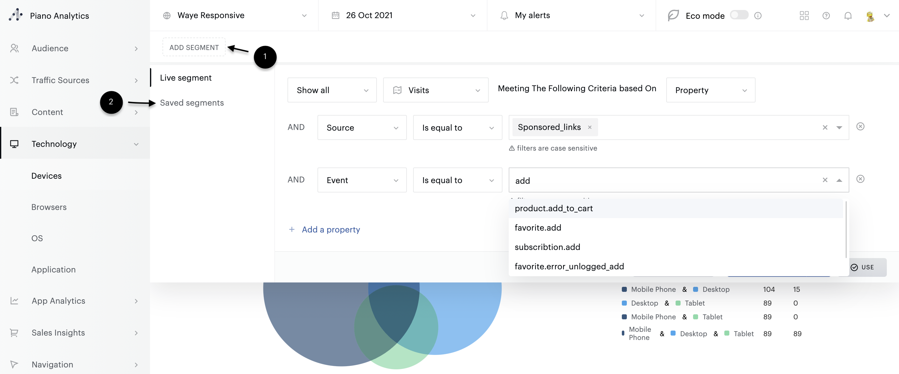
Any segment created on the fly will be available in all analyses - as long as the browser session remains open.
Good to know
A segment on the fly can cover up to 3 properties at a time. Each property can then contain up to 10 selected elements. For more advanced needs we recommend the use of advanced segmentation.
Use a saved segment
Segmentation in Explorer can also be performed from segments that you have created and saved in Explorer or Data Query. By default, all saved segments you have access to are listed in the "Existing segments" tab.
Good to know
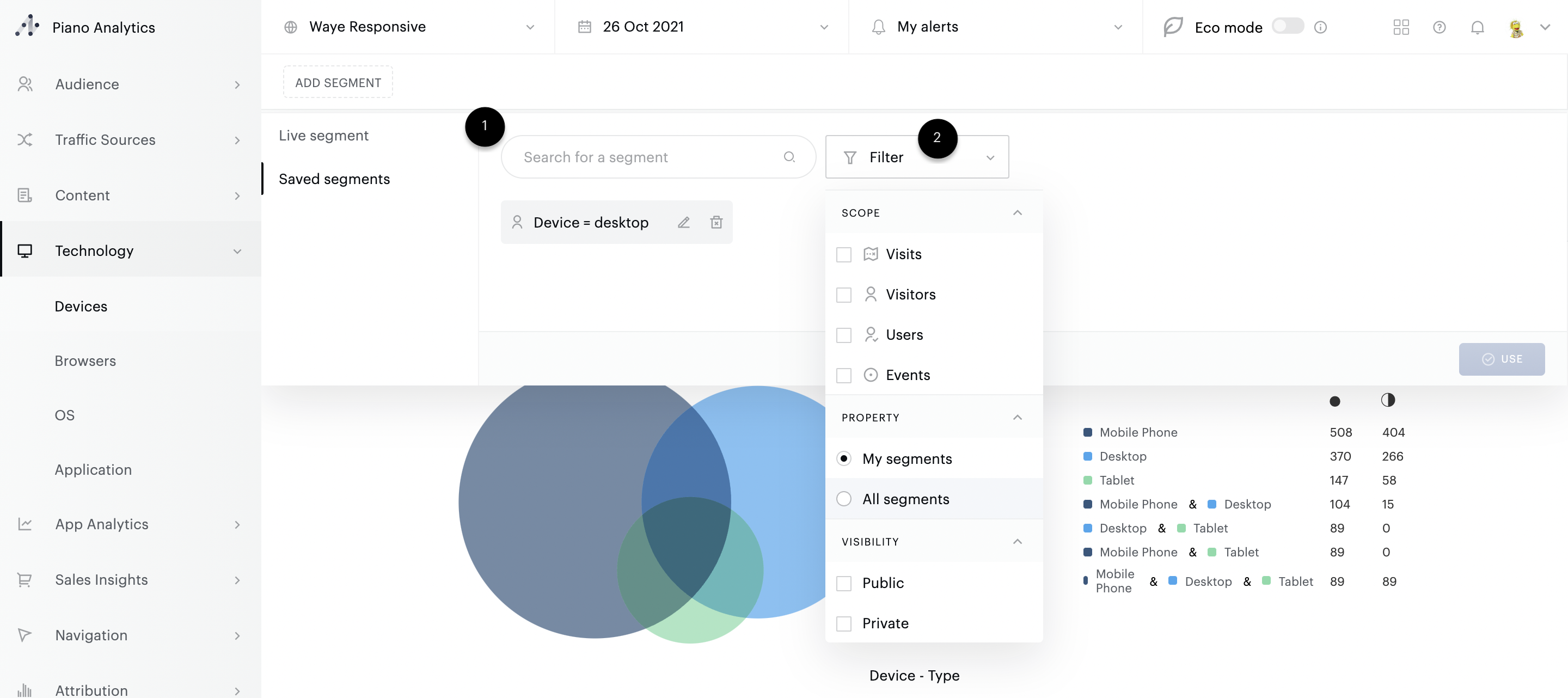
It is not possible to combine several recorded segments with each other, nor is it possible to combine a "live" segment created on the fly with a saved segment.
Apply a segment
In the segmentation bar, each segment is represented by a button. The bar makes it easy to switch from one segment to another in order to easily and efficiently compare the data of an analysis according to different segmentation criteria. This toggle is done via the "segment" button. Each button is built in the same way:
(1) Scope of the segment (by default, in Explorer, the scope is “visit”)
(2) Actions to take on the segment: Activate, Deactivate or Delete

If no segment is applied, select the "Activate" action of the segment of your choice to activate it.
Proceed in the same way if you wish to switch to another segment than the one applied. The old segment will automatically be deactivated in favour of the one you have just selected.
If you wish to deactivate a segment, use the "Deactivate" action. When a segment is activated, the corresponding button is highlighted with an orange border.
Once the segment has been applied, an orange band summarises its composition at the top of the analysis.
Tip
It is possible to compare segmented and non-segmented traffic via the "Comparison: non-segmented" option of the curves.
Customised views
You can save all the modifications (filters, sorting, cross-referencing, etc.) made in an analysis in the form of "Views". These are then accessible in the Explorer submenus.
Create a view
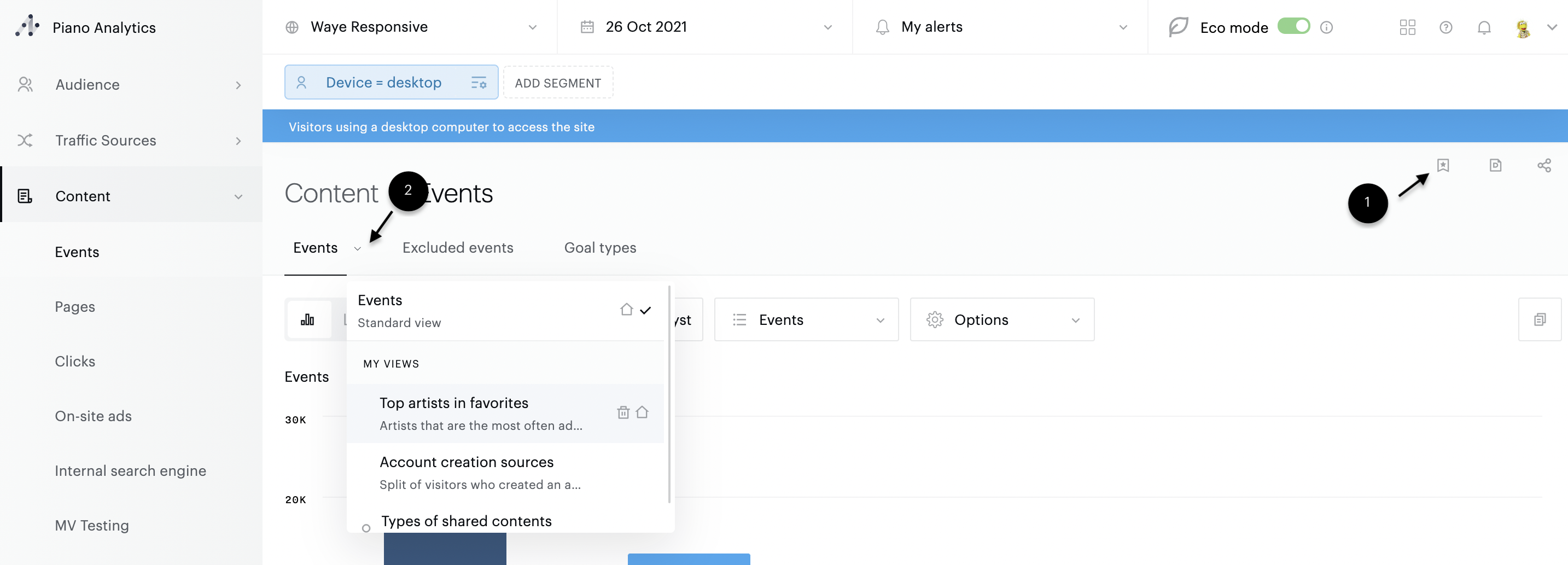
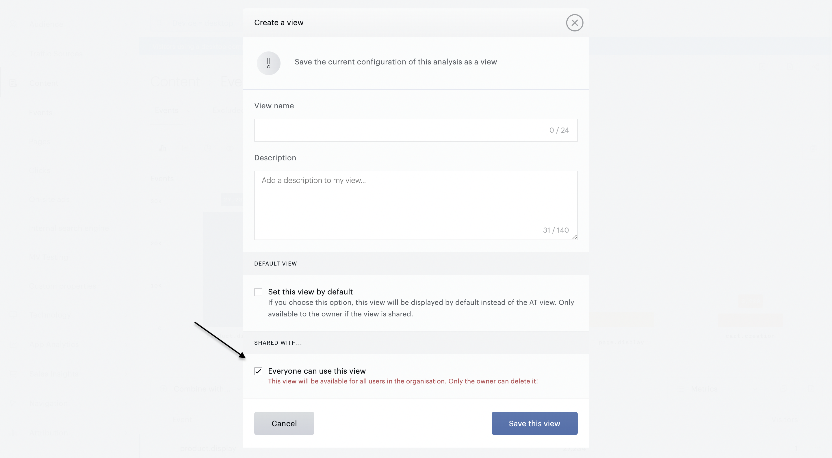
Click on the star at the top right of the analysis to save your view (1). Enter the information required to create it: name (required), description (optional, this will allow you to understand the details of what is behind the view), default view or not (see below).
Once you have validated the creation of the view, it will appear in the level 3 menu, instead of the standard analysis. Click on the chevron next to the analysis name to display all the views available for this analysis (2).
Note
The saved items are as follows:
Graph type (including AXON Analyst)
Graph options (except comparison)
Graph Metrics
Combinations
Filters, sorting applied in the table
Metrics added / deleted in the table
Hidden columns
This means that segments, sites and analysis periods are not taken into account when saving.
Set a default view
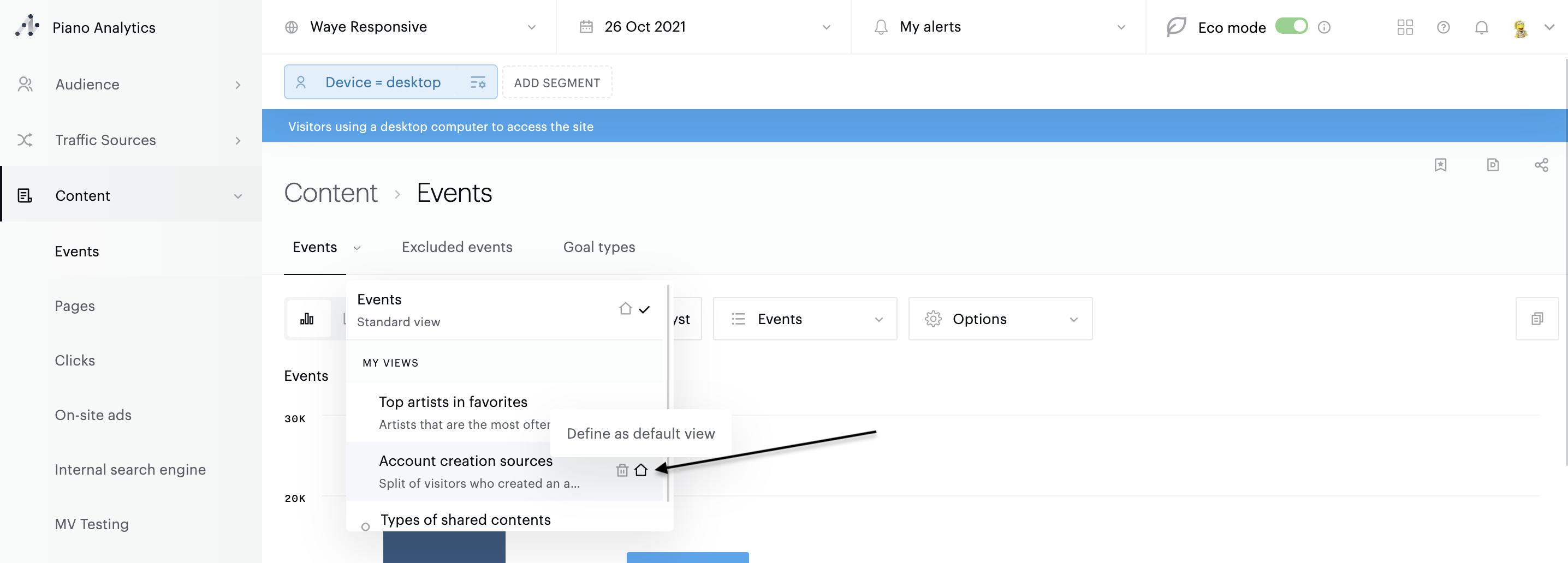
You can replace the standard view of an analysis at any time with the customised view of your choice. This setting can be managed directly when creating the view, or by clicking on the 🏠 icon in the list of analysis views :
Share a view
It is possible to share your views with other users in your organisation. To do this, select the option "Everyone can use this view" when you register.
The shared views are displayed in the same place as your own views, in the "Shared views" category.
Delete a view
To delete a view, hover over the list of views in the scan and click on the bin next to the view. You will be asked for confirmation before the final deletion.
Note
Standard views cannot be deleted.
Only the owner of a view can delete it.
Events & notes
It is possible to annotate Explorer's analyses to record contextual information that may be useful: current event, launching a new application version, server problems, beginning & end of sales etc.
These events can be created from any analysis. To create an event, you must display your data in the form of a curve. By hovering over the curve, and for each of the drawn points, you will have the possibility to add an annotation via the "+" button.
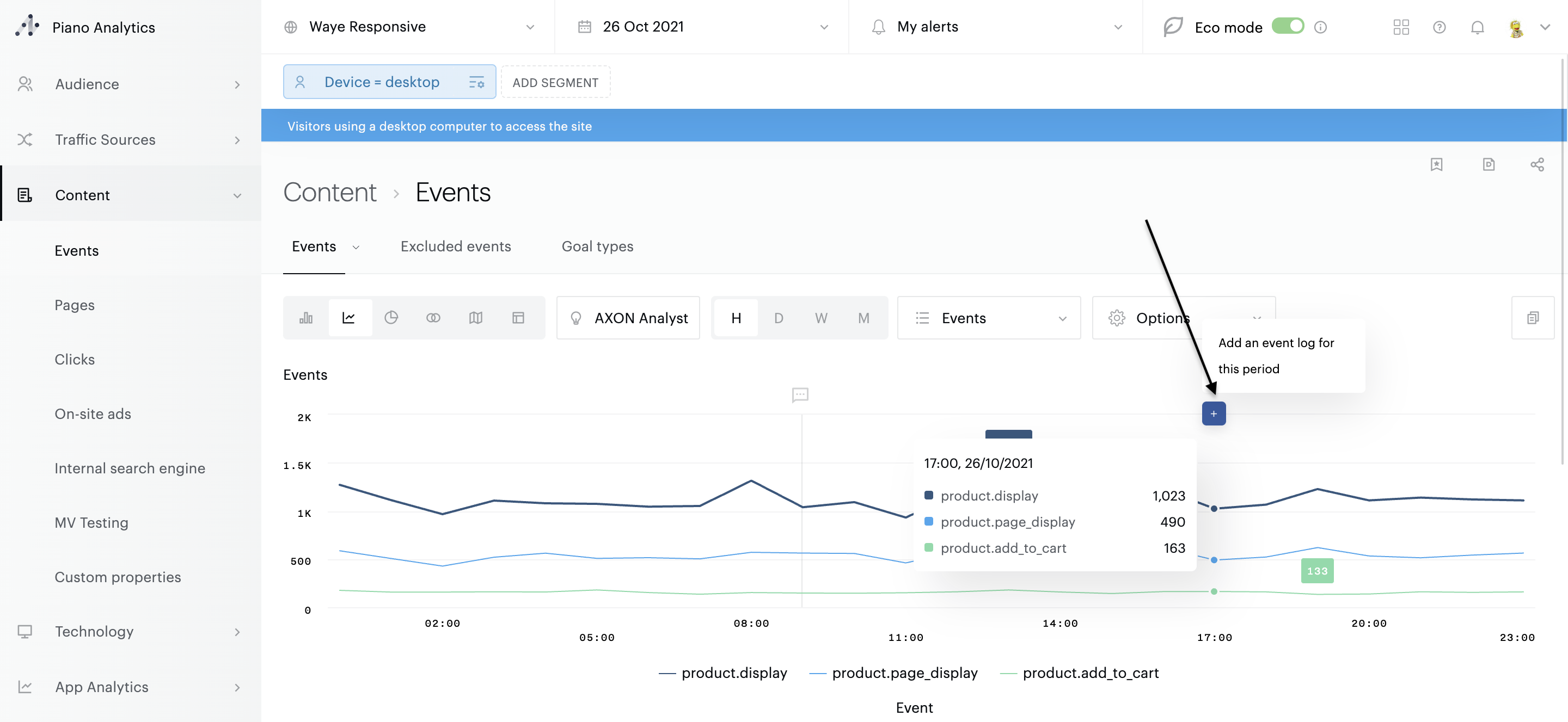
Enter your text, as well as the scope of the annotation. By default, this is "public", which means that it is visible to all members of your organisation. If you do not wish to share this information, simply deselect the "public" box and validate.
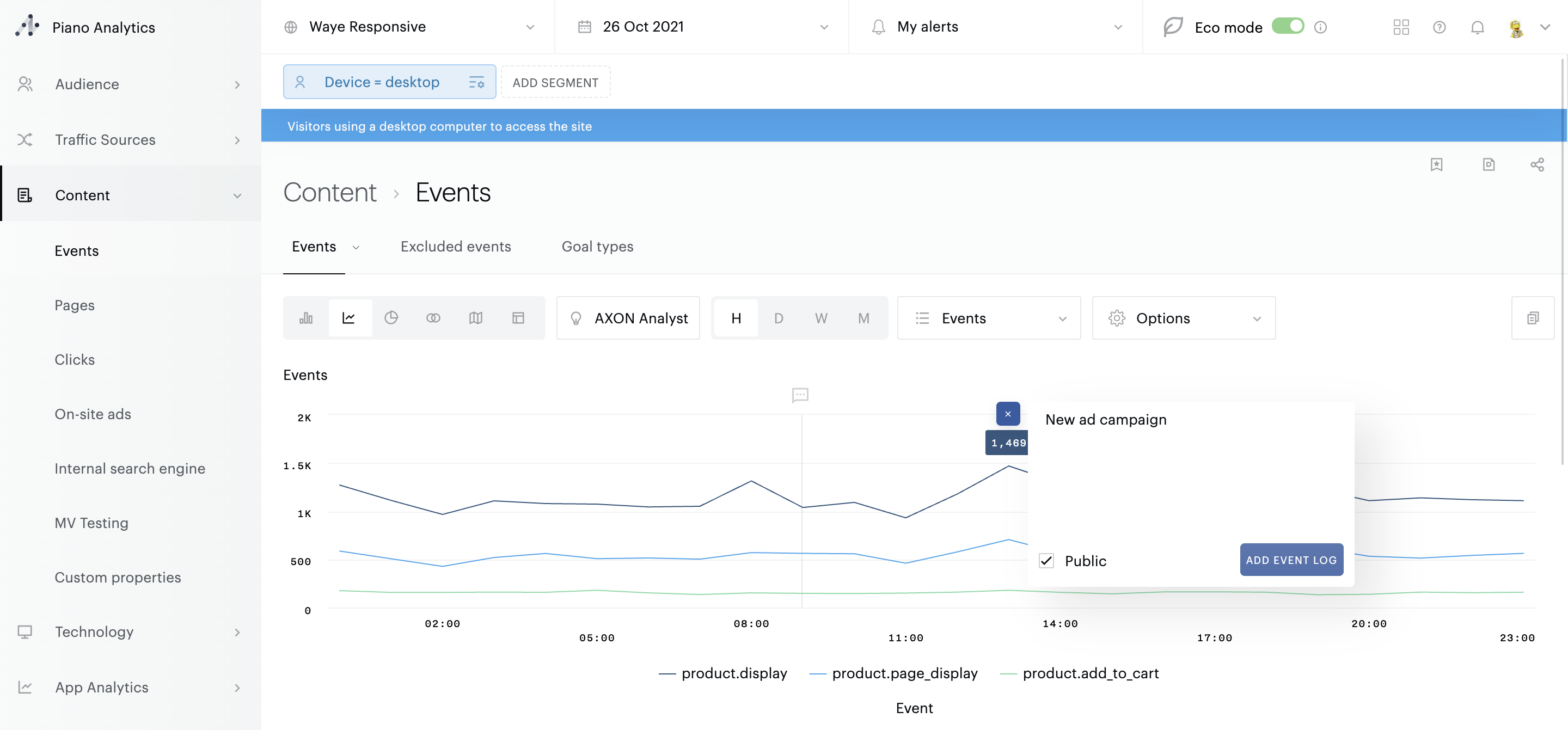
The events created appear as bubbles at the top of the curve. To display the text of the annotation, click on the speech bubble. To delete it, hover over the text: then click on the trash can. You will be asked for confirmation.
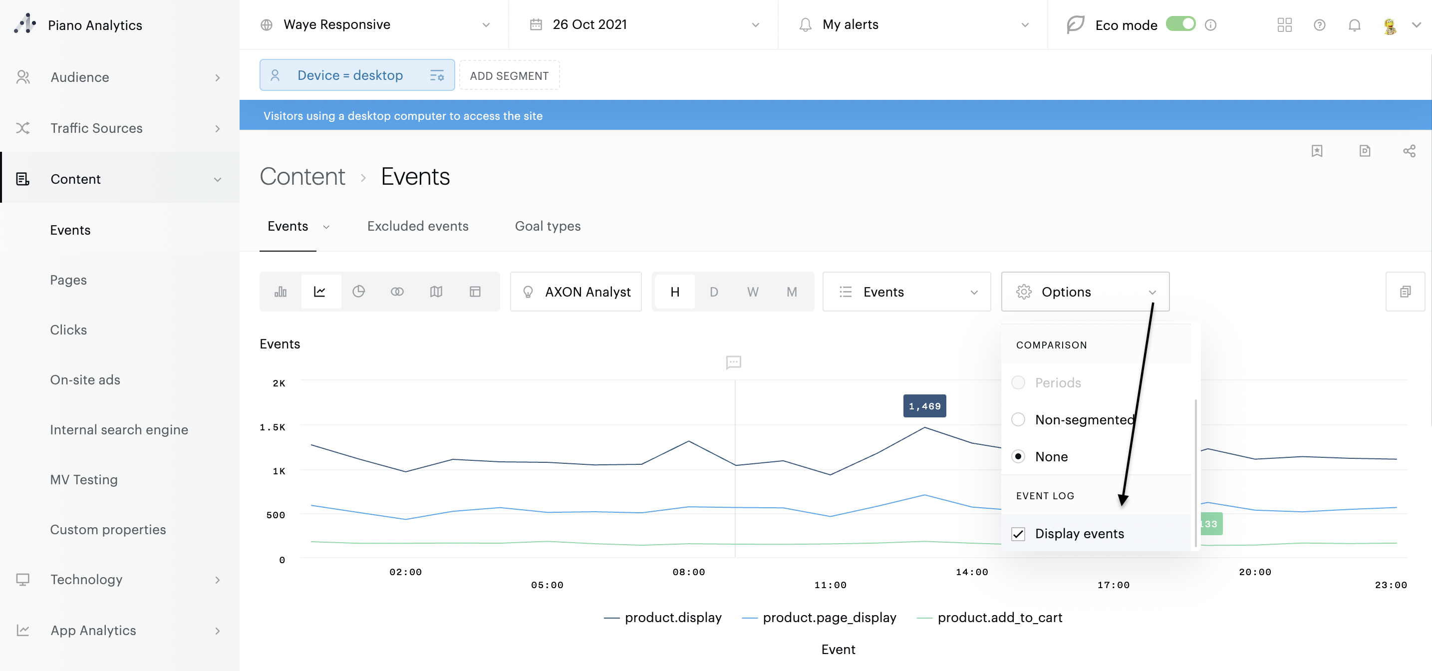
To avoid visual overloads, you can disable the display of this event log. To do this, open the options in the graph and deselect the option "display events".
Information
Shared annotations can be administered by all members of your organisation, which means that they can be deleted by people other than you.
