AXON Analyst - Contribution
Introduction
AXON Analyst's Contribution is Piano Analytics' data science powered feature specifically designed to draw insights efficiently from your data. Seamlessly integrated throughout Workspaces, AXON Analyst's Contribution will do the heavy lifting so you can spend more time on higher-value tasks.
This feature will filter through all your data points to identify and quantify significant trends in your underlying data.
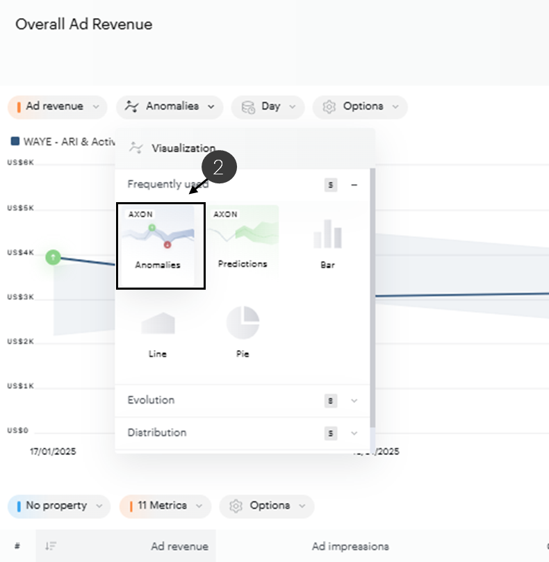
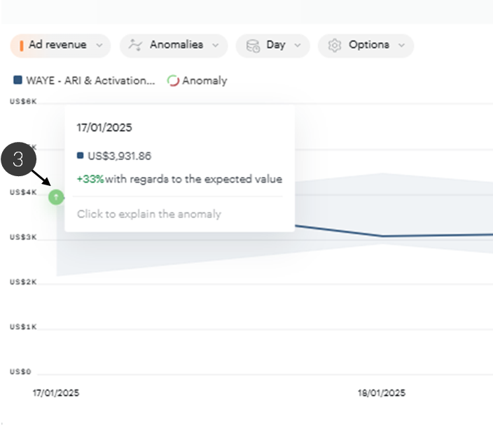
AXON Analyst's contribution power can be unlocked in three steps. Firstly, open your Workspace tile in fullscreen by double clicking it, secondly, (2) simply select the Anomalies graph type by clicking the AXON anomalies icon in the graph type selector then, if present, (3) click on an anomaly of your choice!
Availability
Analyses
The Contribution feature can be activated by clicking on any fullscreen tile in Workspaces. To do this, activate the AXON anomalies graph type in fullscreen, if anomalies are present in daily granularity, you can click on any anomaly of your choice to launch the contribution analysis.
Graph granularities
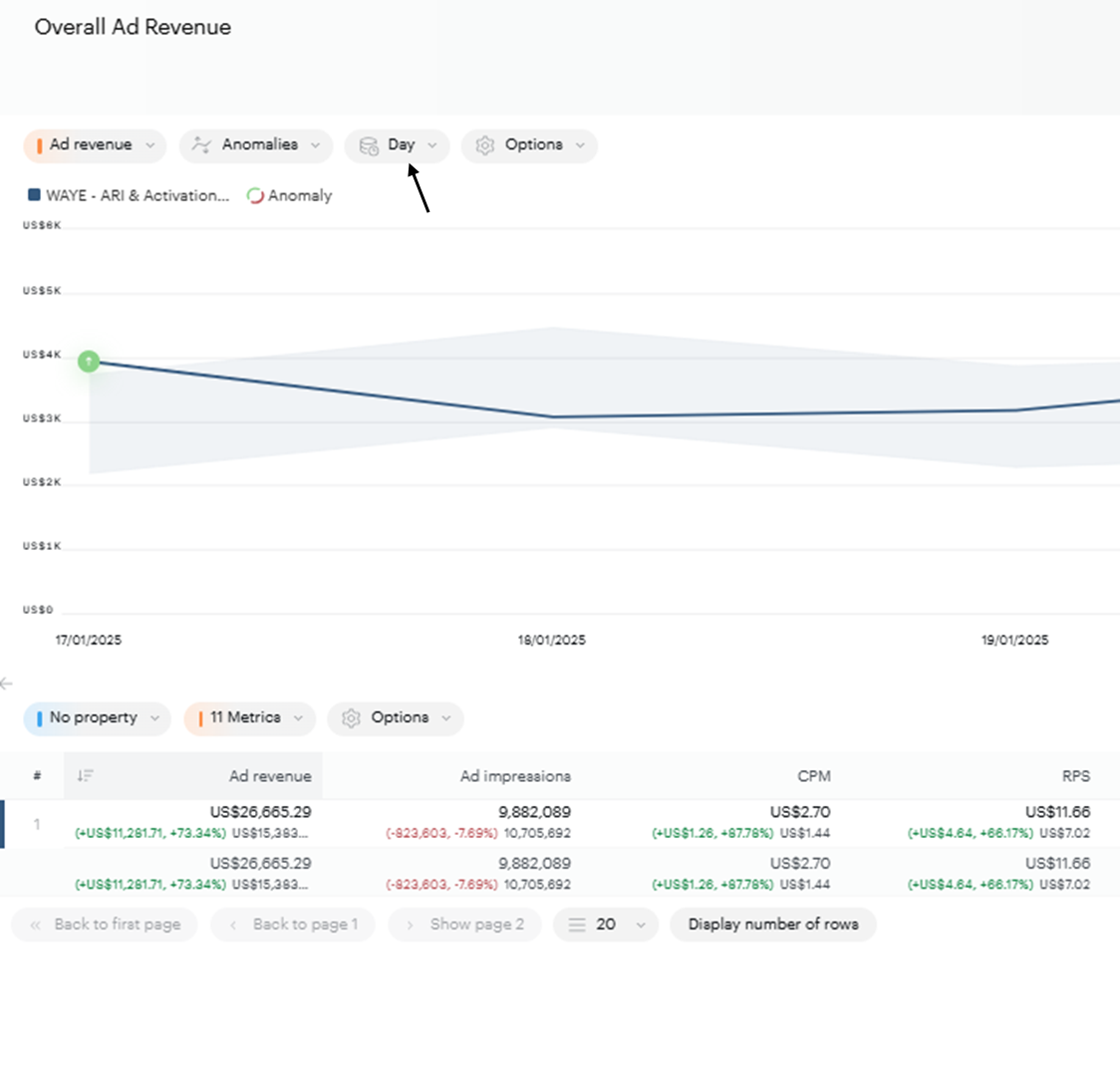
The contribution analysis is available on the daily graph granularity.
Metrics
The contribution analysis is available on any absolute metric of your choice (available on all metrics which are not ratios).
Concepts
Anomaly
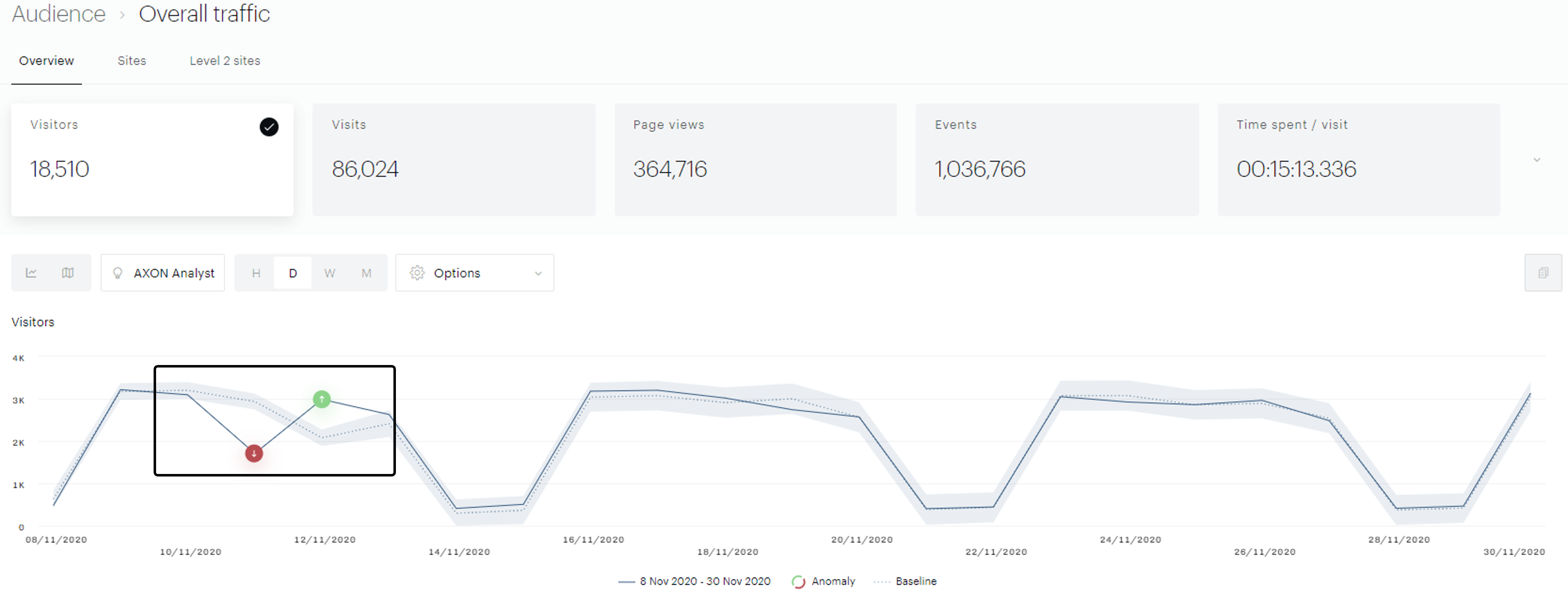
Our built-in anomaly detection algorithm identifies how your data should evolve within a tolerance area. If your curve leaves this tolerance zone an anomaly will be identified and highlighted with the positive or negative anomaly icons.
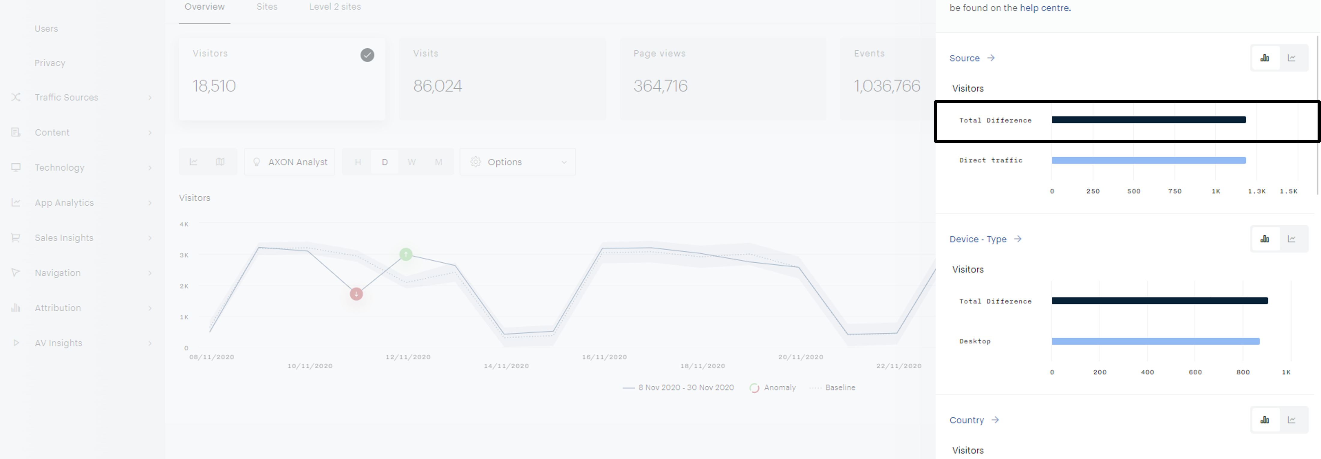
Total Difference
The difference between where your data should lie (baseline - dotted line in the screenshot below) estimated by our algorithm and where your curve lies.

Property & property values
A property is an attribute of an event. Device, Traffic Source, Browser type are all properties. Properties have values, such as desktop, smartphone, tablet for the Device property.
Contribution
The share of the total difference attributed to a specific property value.
Interpretation of the results
Each bar chart represents one property.
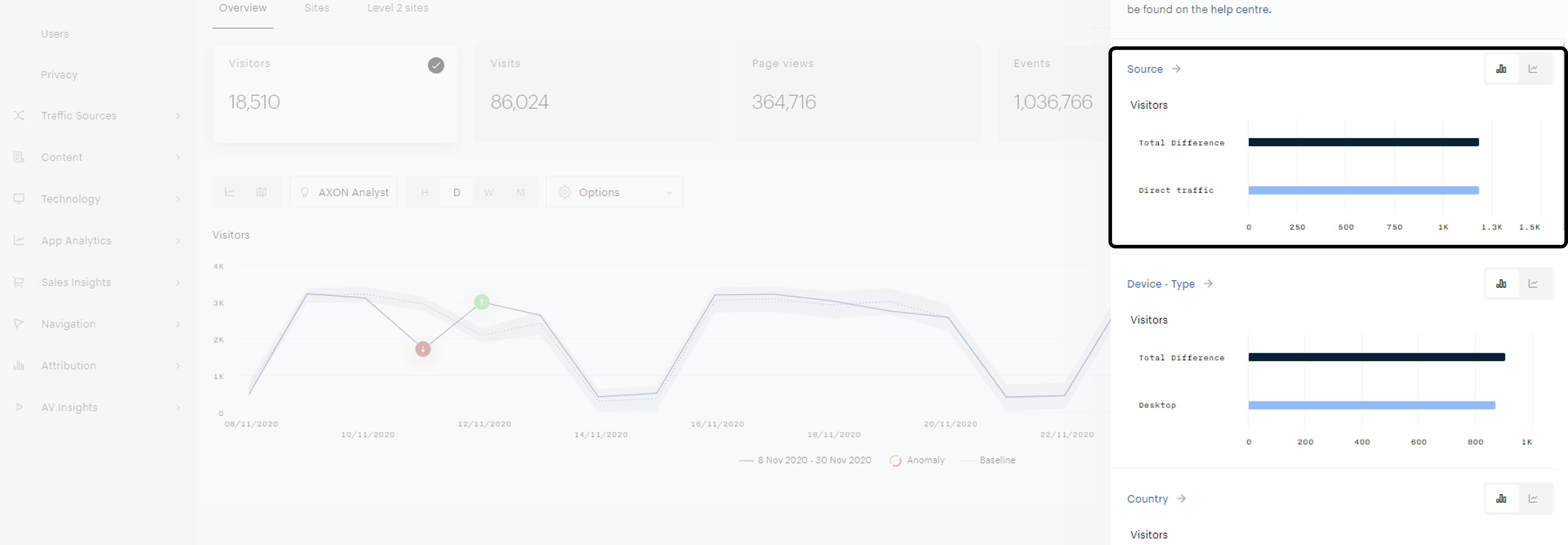
The navy-blue bar represents the anomaly that we are looking to explain : the gap between expected data and actual data of the overall anomaly.
The light blue bars represent each property value’s share of contribution to the overall anomaly.

Note
We show the top 3 values for each property with the same sign as the overall anomaly. For example, if we are analyzing a positive anomaly, we will show the top three positive values. Conversely, we will show the top three negative values for negative anomalies.
Note
Although we only show the top 3 values for each property, the sum of all the property values' contributions is equal to the overall contribution (the navy-blue bar).
Order of the results
Order of the bar charts
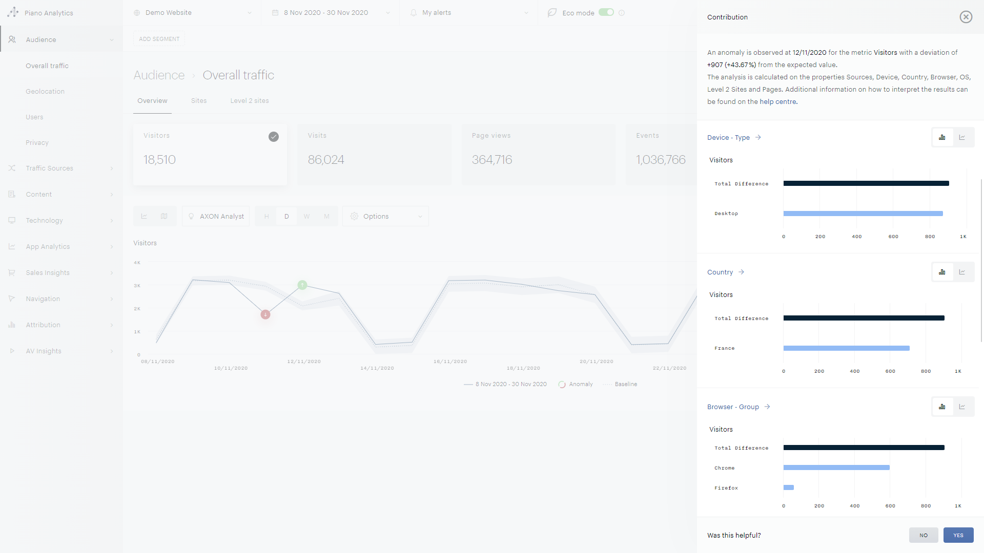
The charts are ranked in decreasing order on their top value's contribution. In the example below, the value 'Desktop' contributed to 95% of the total difference whereas the value France contributed 80%. Therefore, the properties 'device' and 'country' are ranked first and second in the list of bar charts.
Order of the properties
For each property, within the graphs, the values are ranked in decreasing order on their contribution to the overall anomaly.
FAQ
Which properties are analyzed?
The contribution will look for significant results in the following properties: device, traffic source, country, OS, Browser type, Level 2, Pages.
I can't find a specific property or property value
The contribution only shows properties and property values with significant results for a given anomaly.
I'm analyzing segmented data, will the contribution look within that context?
The contribution will look for significant results by keeping in mind your analysis scope and segments.
A value contributed more than the overall anomaly (A light blue bar is bigger than the navy blue bar)
Sometimes property elements work against each other: As an example imagine a positive anomaly of 100 visits above what was expected, where desktop traffic increased 120 visits and smartphone traffic decreased by 20 visits. In this case desktop traffic over-compensated for the decrease in smartphone traffic resulting in a positive anomaly of 100 visits. These are all valuable insights in order to understand what happened on a given date!
