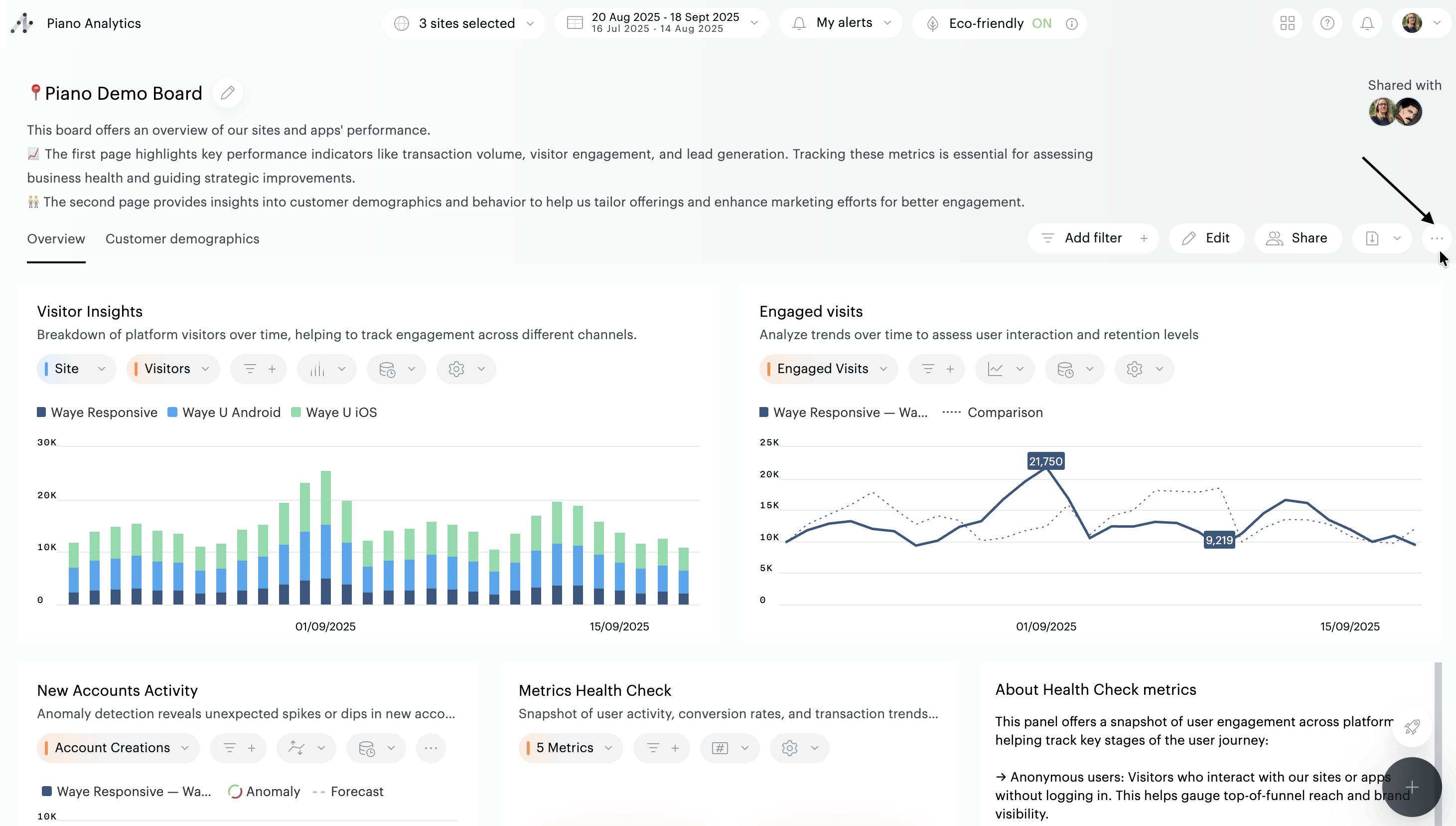
Set the context of the board
The functionalities allowing you to choose your perimeter of analysis (sites and periods) are located at the top of the user interface.
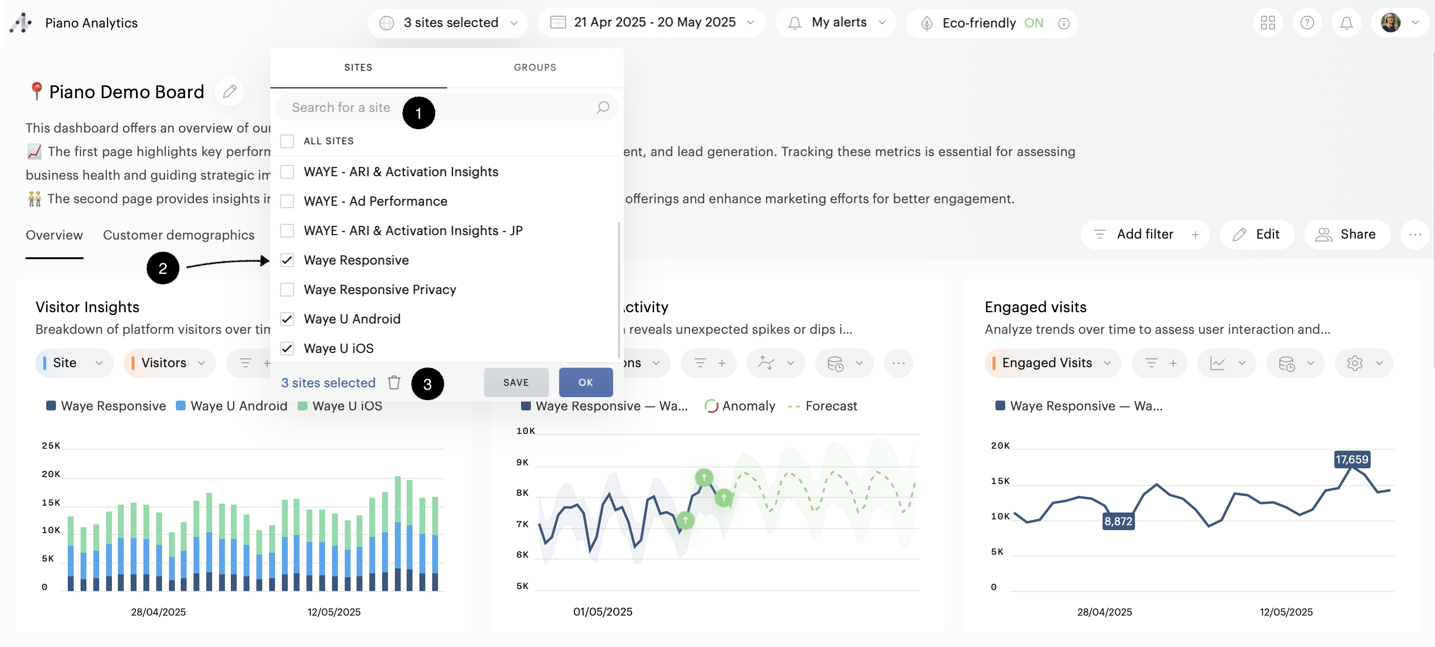
Selecting sites
The first drop-down menu allows you to select a site or several sites. The search engine integrated in the drop-down list (1) allows you to access the sites you wish to use more quickly.
To select a site, click on its name (2).
To select multiple sites, click on the corresponding checkboxes (2) and then click on the "OK" button.
A summary of your selection is available via the link at the bottom of the drop-down list (3).
On the overview screen you can view the list of selected sites, modify your selection by deleting one or more sites (1), reset your selection (2), or return to the list of all sites (3). You will then have to re-select at least one site for new data to be displayed.
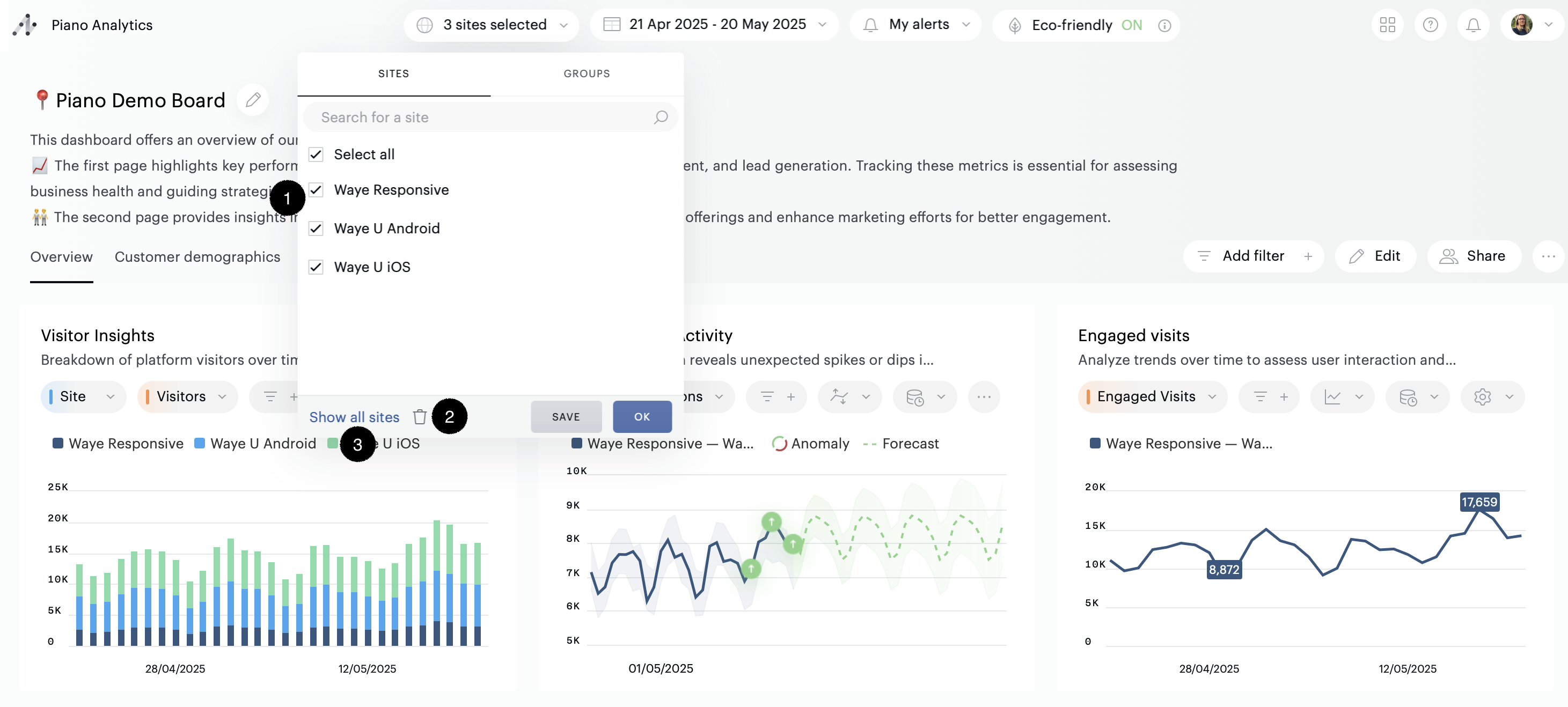
When you select multiple sites, a "save" button allows you to save your selection as a group of sites. Once at least one site group has been created, you can find, edit or delete it from the "groups" tab .
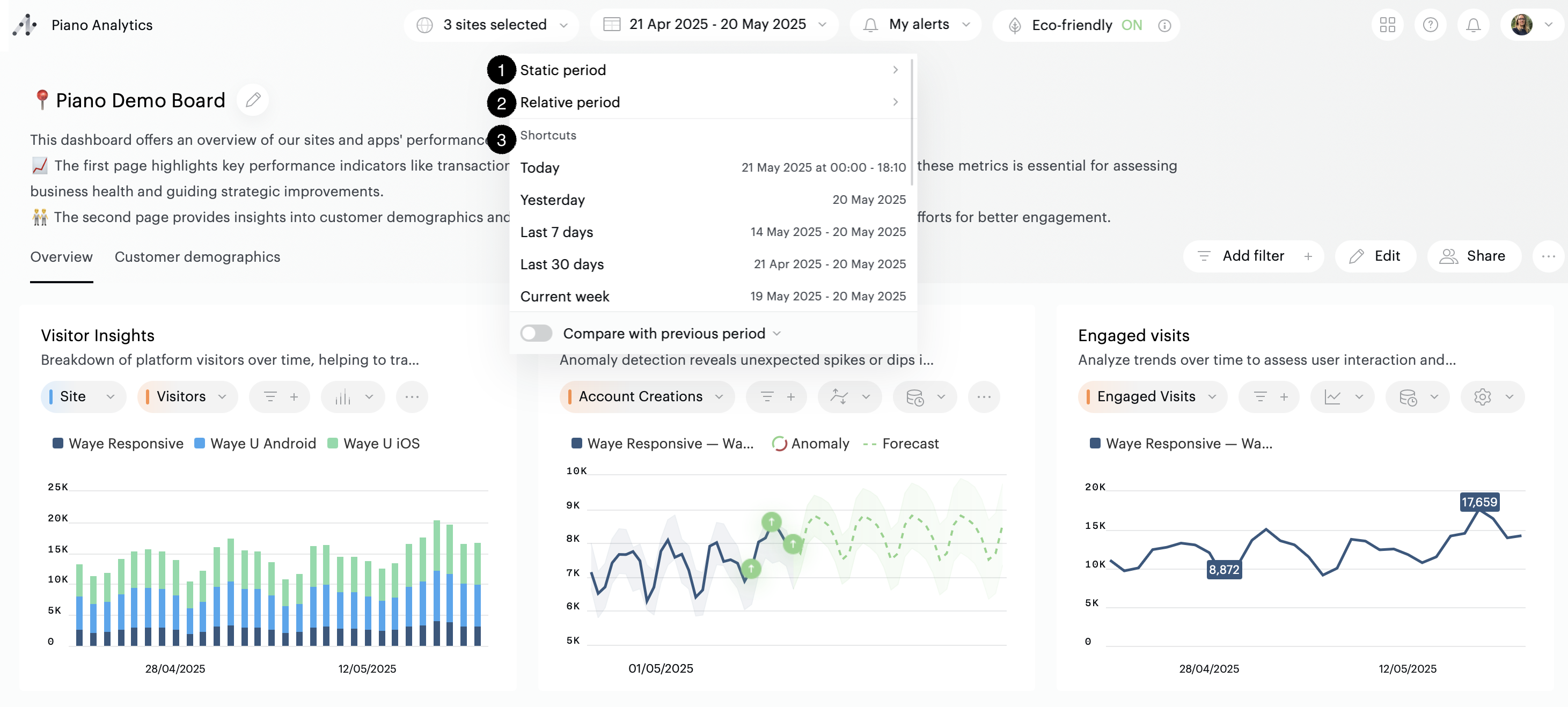
Period selection
In the second menu, you can select the period to be analyzed.
There are two ways to define a period:
-
Static period (1) – by selecting specific start and end dates.
-
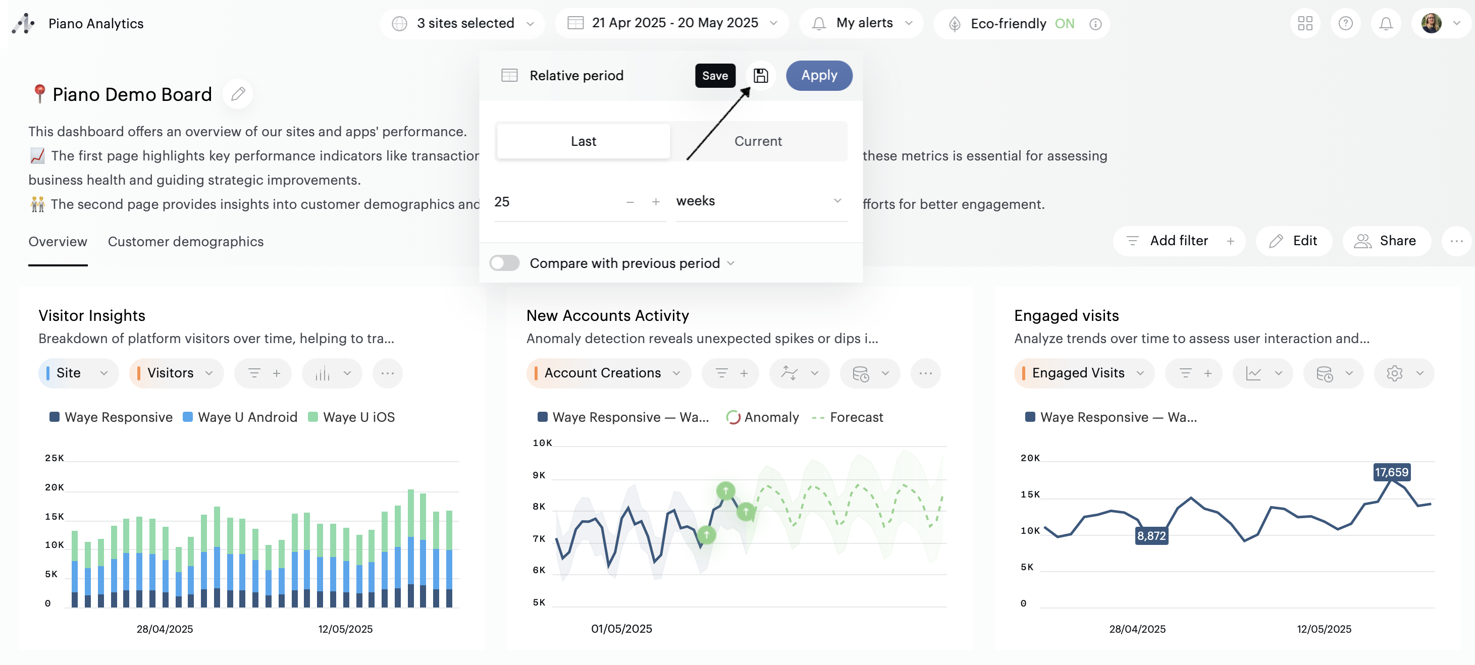
Relative period (2) – by choosing a time range based on the current moment:
-
Past: last X minutes, hours, days, etc.
-
Current: current hour, day, week, etc.
-
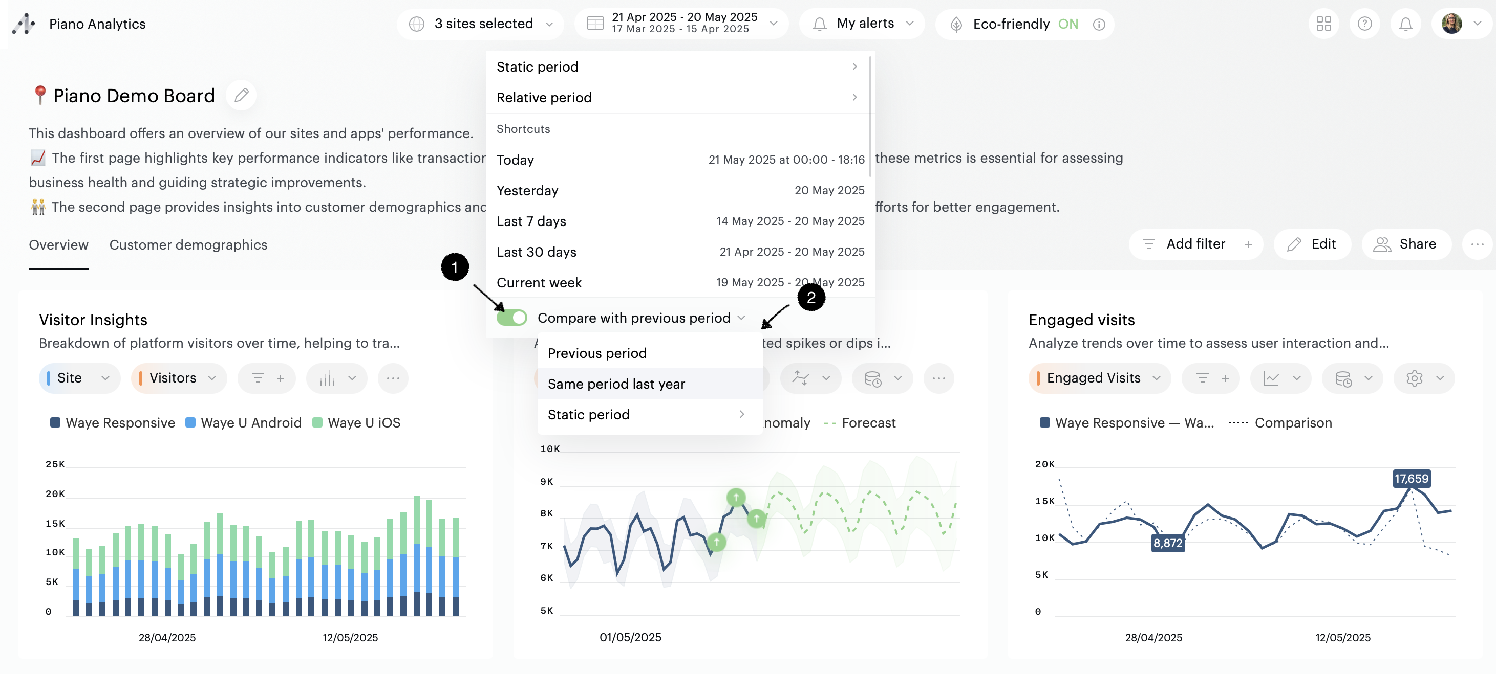
By default, Piano Analytics offers a list of commonly used predefined relative period shortcuts to help you get started quickly (3).
To create your own shortcut, set up a relative period and click the “Save” button:
Comparison period
It is possible to compare the values of the current period with those of a past period. To use this feature, you must enable the "Compare with previous period" option (1).
By default we compare the data of the current period with those of the previous period. It is possible to customize the comparison period (2).
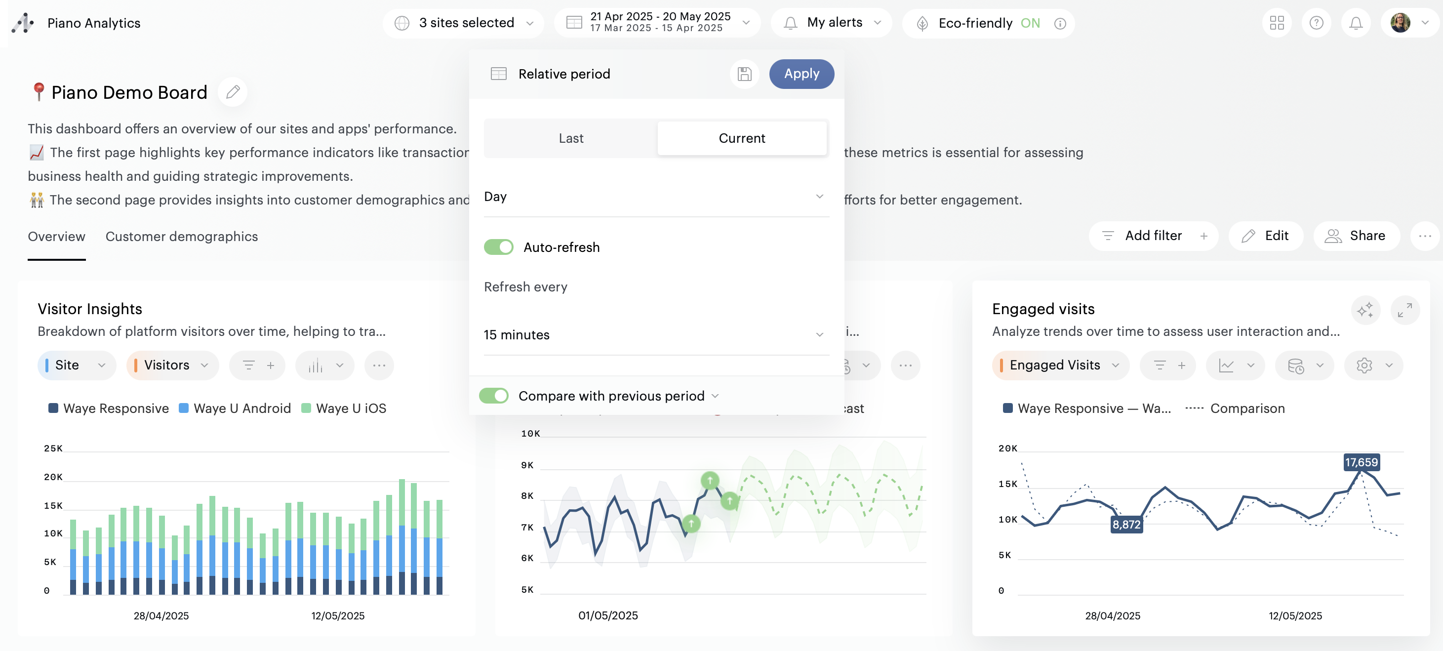
Auto-refresh
If you are using a board to monitor the performance of your KPIs in real time, you can activate the “Auto refresh” feature. Based on your settings, it will automatically reload the contents of your board every 15, 30, 45 or 60 minutes.
Auto-refresh is available only on periods containing data from the current day
On-the-fly actions
It is possible to interact with the tiles to analyze the data they present in different ways:
-
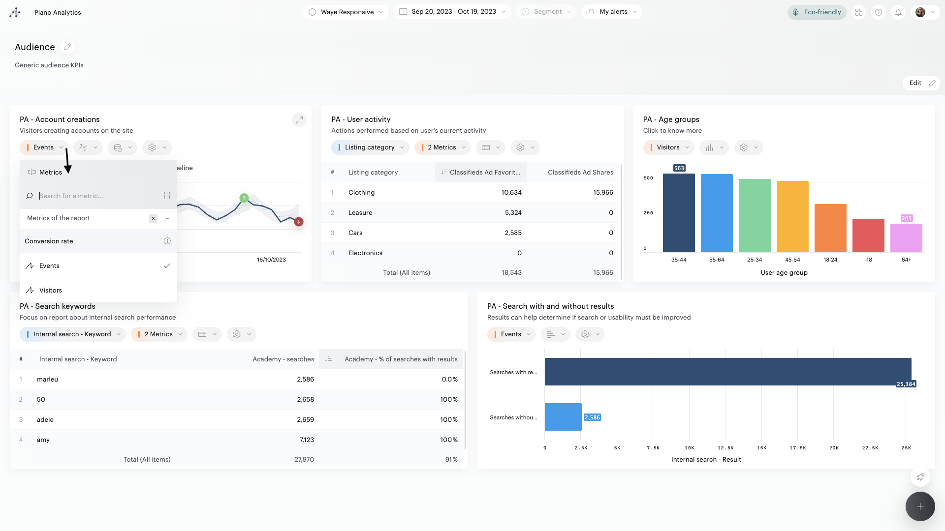
Click on the name of a metric to replace it with another metric available in the report
-
Click on the "view " icon of a tile to change the default graphic display

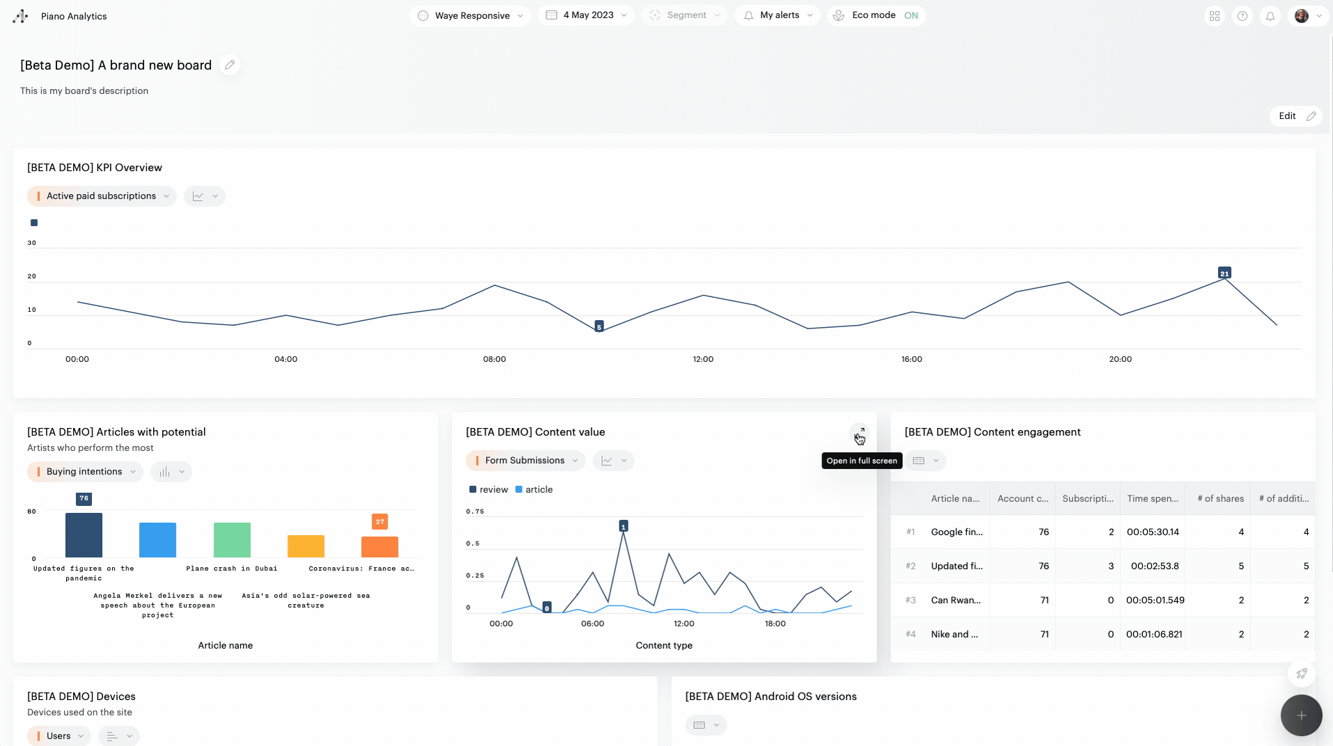
Full screen tiles
Click on the icon at the top right of a tile to open it in full screen: you will then be able to interact with the report exactly as in Explorer.
The full screen view allows you to further explore and manipulate the data synthesized in the tile. The manipulations performed are not saved when you leave this view so as not to alter the initial content of the tile or the board.
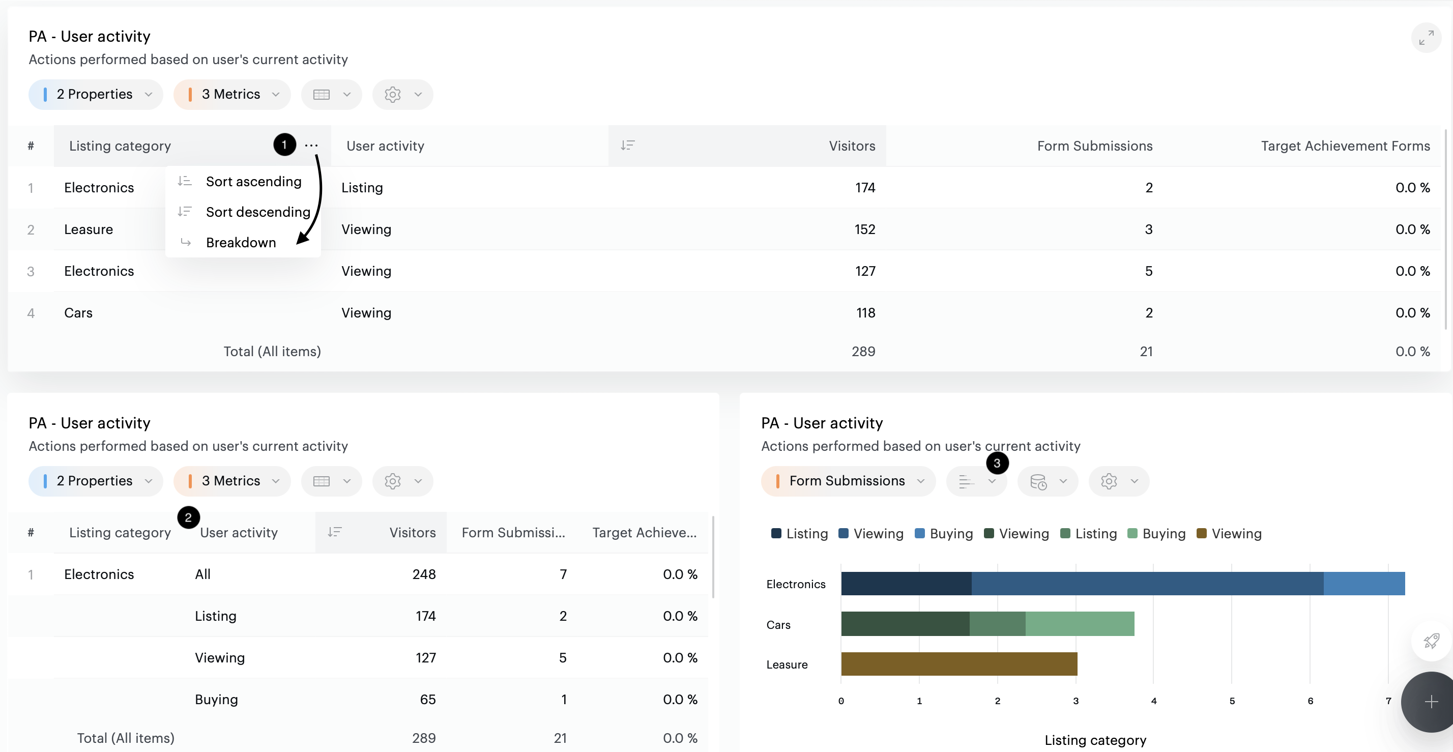
Breakdown
You can combine two properties in a report, grouping their values together. In this way, for example, you can obtain details of cities associated with their country of origin. Breakdown can be activated and deactivated when multiple properties are used in the report.
To activate breakdown, click on the "…" at the end of the property’s cell and click on "Breakdown" to activate the breakdown view in the table.
Below is example where you can see how to active the breakdown (1), and the resulting displays: in a table (2), and a dedicated representation (3).
Color palette
You can change, on-the-fly, the colors used in visualizations. To do this, click on the "..." in the board toolbar, click on "Color Palette", then select one of the predefined palettes (high contrast, colorblind-friendly, monochrome).
This choice will not be saved.