
Data Query lets you explore your analytics data, build reports, and share results — through a flexible interface that supports both natural language and manual report building. This page walks you through the main features, with links to dedicated articles for more depth.
Building your first report
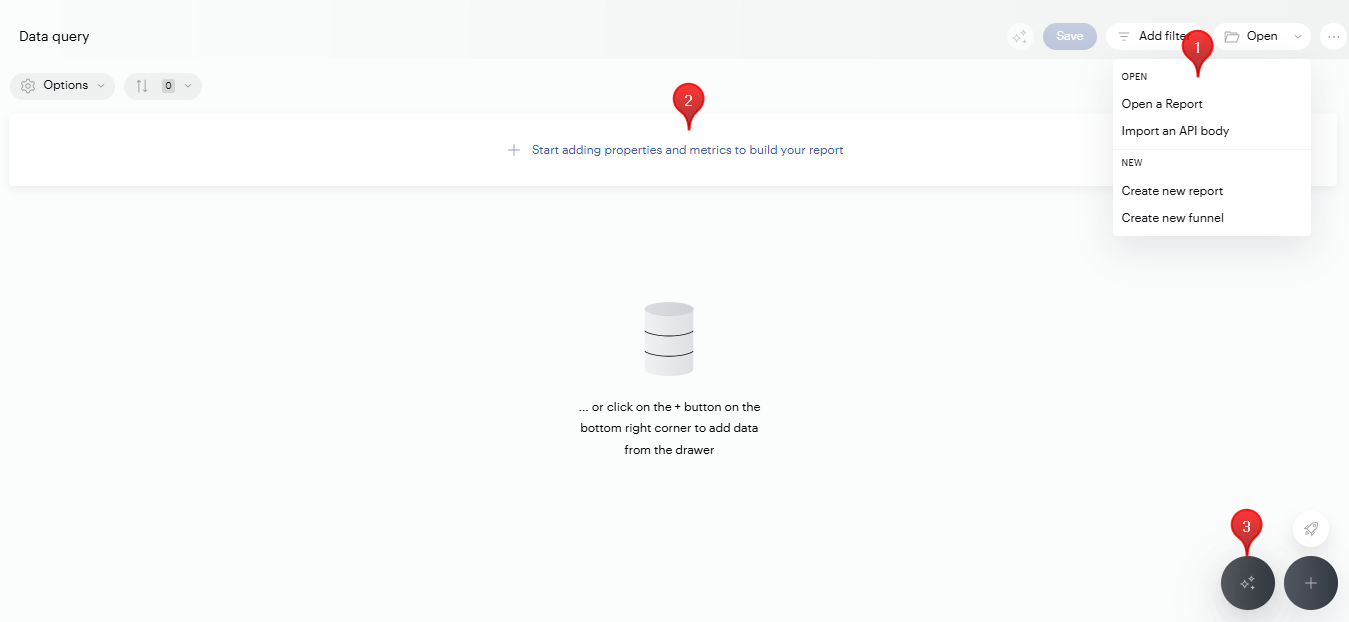
There are several ways to start a report in Data Query:
-
Open menu — Use the Open menu in the top-right corner to:
-
Open a Report — Load one of your existing reports.
-
Import an API body — Paste an API body to reconstruct a report from a Reporting API call.
-
Create new report — Start a fresh report from scratch.
-
Create new funnel — Build a funnel to track multi-step conversion journeys (see Create Funnels).
-
Start adding properties and metrics — Click Start adding properties and metrics (or the + button in the bottom-right corner) to open a drawer with all available properties and metrics. Drag and drop elements into your report, or double-click to add them.
-
Use AI Query — Click the AI Query button on the homepage and type your request in natural language (e.g., "What are the top traffic sources last month?"). See AI in Data Query for details.
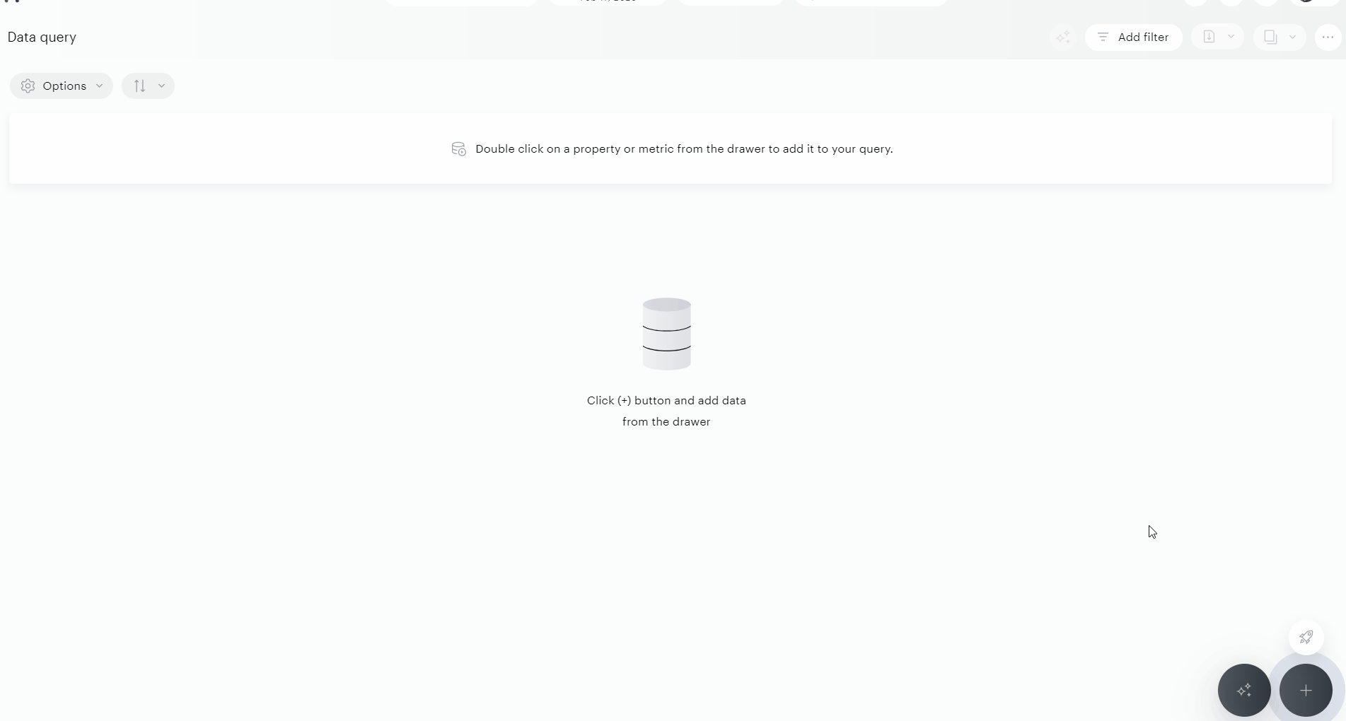
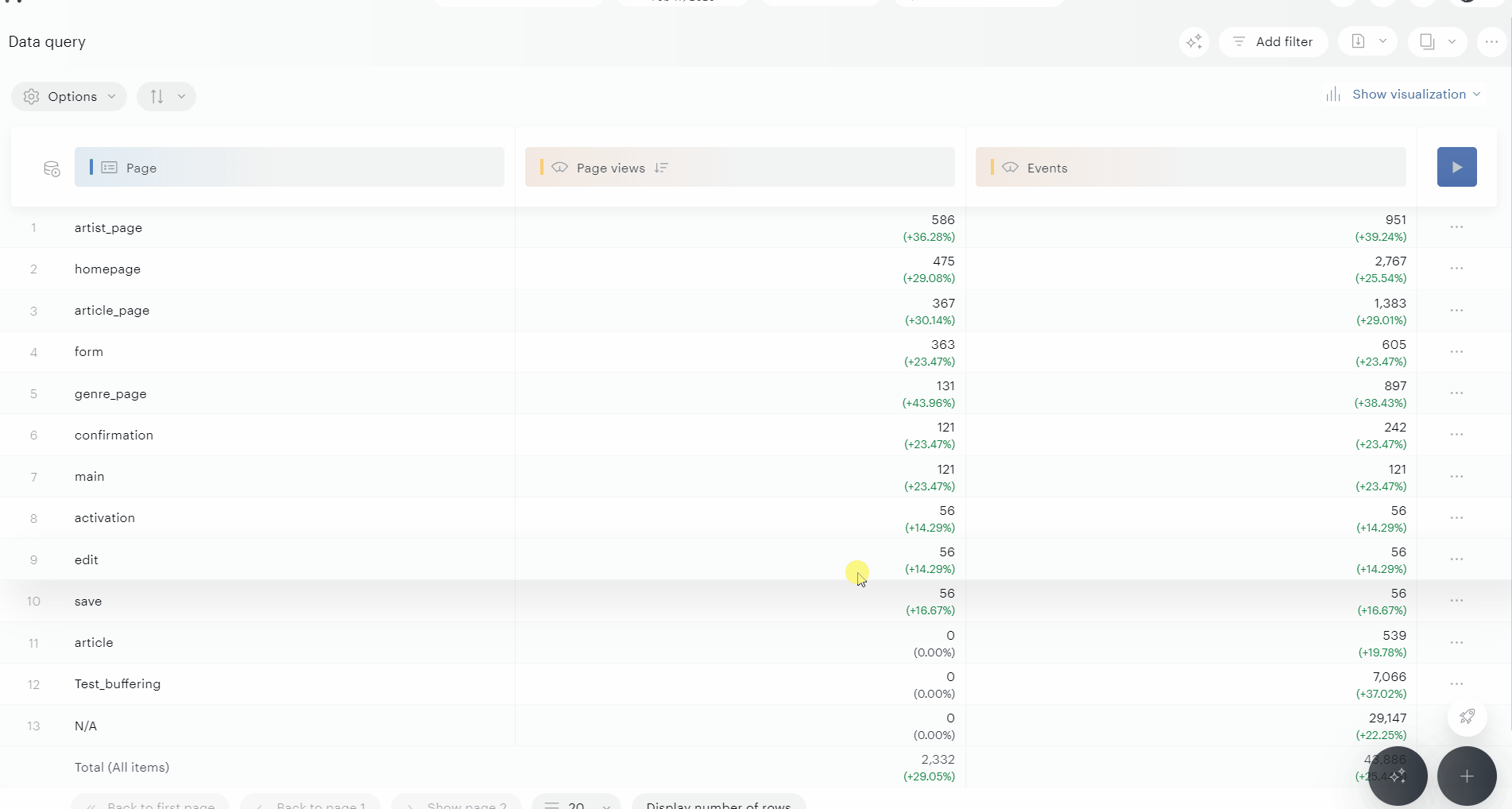
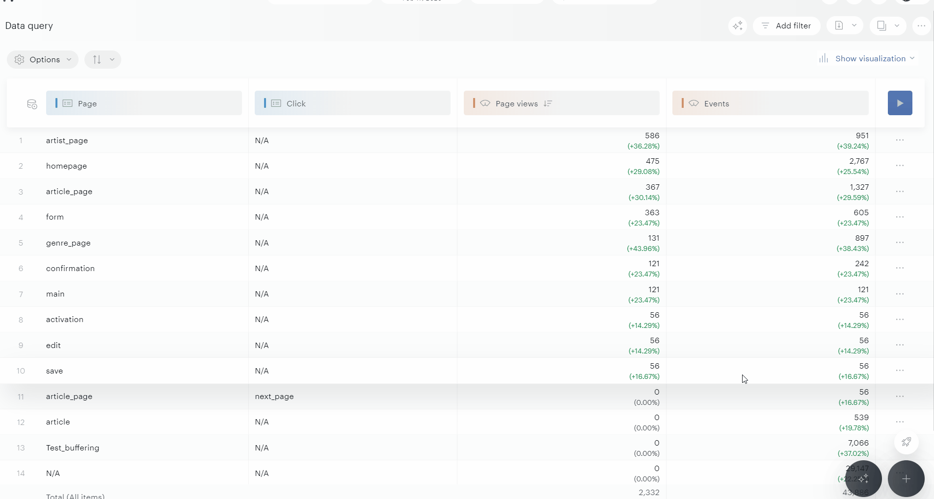
Once you've added at least one element, you can click directly within the table header to add more.
Don’t forget to hover over any property or metric to see its description.
Exploring the data model
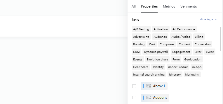
Your data model includes hundreds of properties — both Piano's out-of-the-box elements and your custom properties. To navigate it efficiently, use the Tags system in the properties drawer. Tags let you filter relevant items so you can find what you need without scrolling through the full list.
By default, only active items appear. To work with inactive items, see Handling of Active and Inactive Items.
Working with properties and metrics
Property actions
Clicking on a property reveals several available actions:
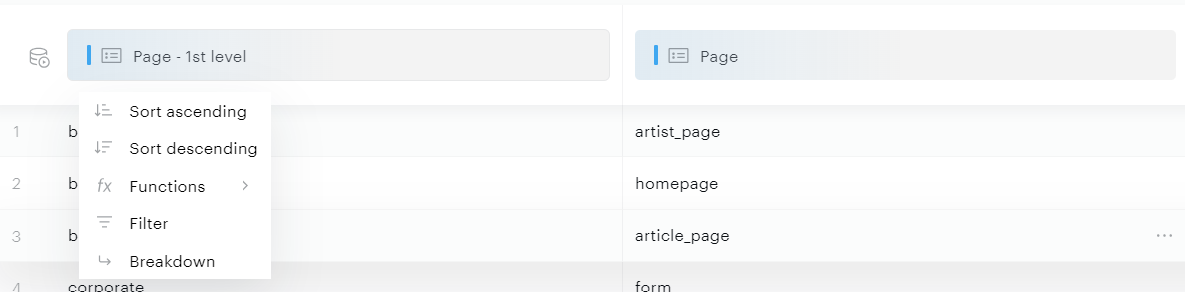
-
Sort: Arranges property values in ascending or descending order
-
Functions: Available functions vary by property type:
-
Approximate count distinct: Counts unique values within a property
-
Max, Min: Returns the maximum or minimum values of the property
-
Sum, Average: Calculates the total or average of all property values
-
Median and Percentile: Returns the median value or your specified percentile
-
-
Filter: Opens the filter panel with the selected property pre-selected
-
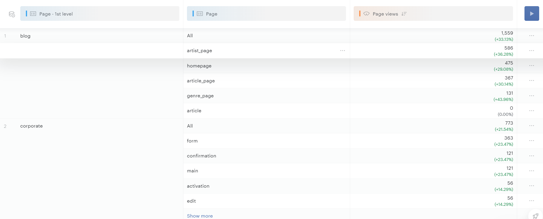
Breakdown (when at least 2 properties are selected): Creates a breakdown between the current property and the subsequent one. The example below shows a breakdown on the "Page - 1st level" property, displaying grouped values for the first property followed by values for the second property.
Want to filter by a property without displaying it as a column in your results?
Option 1: Use the Filter Button
-
Click the filter button in the Data Query interface.
-
Select the property (dimension) you want to filter on.
-
Choose the value(s) for your filter.
-
Apply the filter — the property will be used for filtering but will not appear as a column in the dataset.
Option 2: Filter Then Remove the Property
-
Add the property to your dataset.
-
Apply a filter directly on that property.
-
Remove the property from your dataset.
-
The filter will remain applied even after the property is removed from the visible columns.
Metric actions
Clicking on a metric provides access to the following actions:
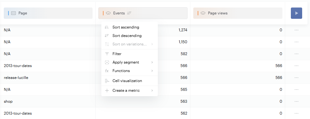
-
Sort: Arranges metric values in order. When comparison is enabled, you can also sort by variation
-
Functions:
-
Ratio of total: Returns the percentage of your metric value relative to the overall total
-
Difference from total: Calculates the difference between your metric value and the overall total
-
-
Create a metric: Enables creation of basic metrics using operators and two existing metrics
-
Apply segment: Creates a metric using a specific segment (e.g., applying the "Google" segment to the "Visits" metric creates "Visits from Google")
-
Filter: Opens the filter panel for the selected metric
-
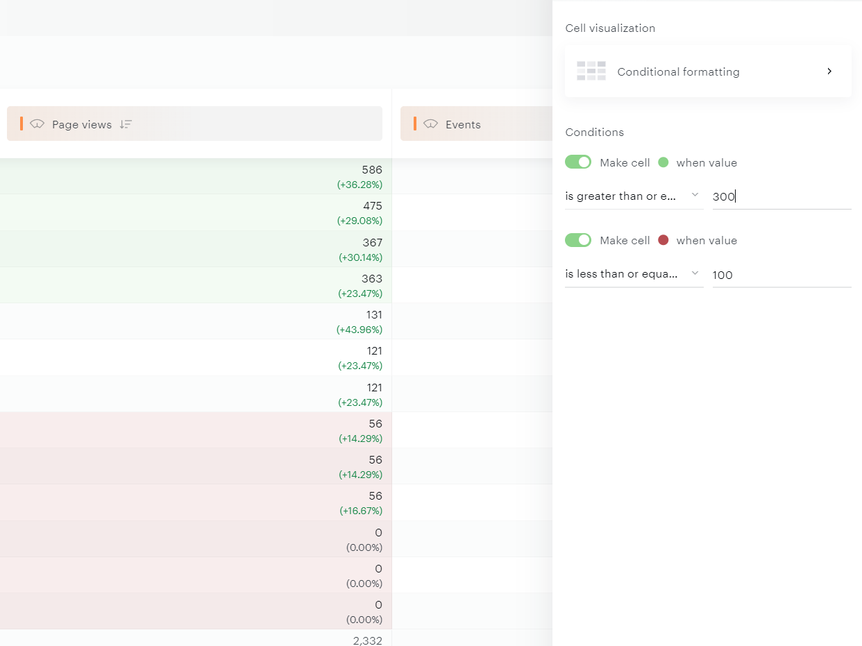
Cell visualization: Provides access to three visualization tools, including anomaly detection and predictive analytics
-
-
Horizontal bar: The default cell visualization adds a horizontal bar within the metric cell
-
Line: Displays metric evolution directly within the cell for quick trend analysis. You can maintain a single color or use trending colors (green for upward trends, red for downward trends)
-
Conditional formatting: Allows creation of two rules for custom cell coloring
-
For more advanced needs, you can also build Custom Metrics, Funnels, and apply Segments.
Saving your report
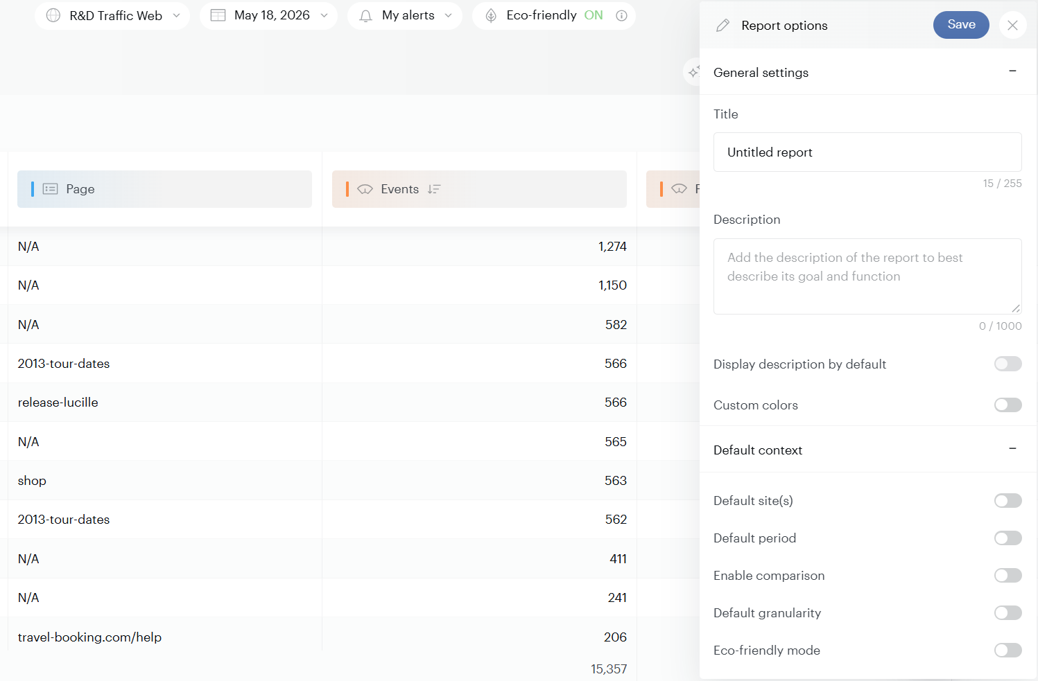
Once your report is ready, click Save in the top-right corner to open the Report options panel. Saved reports are available in the Open menu.
The panel is split into two parts:
General settings
-
Title and Description — Name your report and explain its purpose.
-
Display description by default — Show the description automatically when the report opens.
-
Custom colors — Apply your own color scheme to the report.
Default context
Set the context that loads automatically when you reopen the report, so you can pick up where you left off without reconfiguring every time:
-
Default site(s) — The site or sites to load by default.
-
Default period — The date range to apply on open.
-
Enable comparison — Turn on period-over-period comparison automatically.
-
Default granularity — The time granularity (e.g., day, week, month).
-
Eco-friendly mode — Load the report with eco-mode on
AI-powered analysis
Data Query includes two AI features to help you go from data to insight faster:
-
AI Query — Generate datasets from natural language prompts.
-
AI Reveal — Let our AI system analyze any dataset and surface actionable insights automatically.
See AI in Data Query for both.
Sharing and exporting
When your report is ready, open the options menu (three dots, top-right) to share or reuse it:
-
Download table's first 10,000 rows — Export the top 10,000 rows of your dataset in CSV format.
-
Download the table current page — Export only the visible rows in your dataset.
-
Download GZip file — Export your data as a compressed
.gzfile, useful for large datasets or programmatic processing. -
Copy graph data to clipboard — Copy the data behind the current graph.
-
Copy table data to clipboard — Copy the data from the current table view.
-
Copy API Body — Use the API body to query your dataset programmatically.
-
Generate API key — Create a Restricted API Key scoped to this report for secure programmatic access.
Subscriptions (scheduled exports) : beyond one-off exports, you can schedule recurring deliveries of a report's data using Subscriptions. Once configured, the report runs automatically at the chosen frequency and is delivered as a CSV — either to an FTP destination or Amazon S3 bucket.
Subscriptions are managed from the Library, and require the report to be saved first.
See Subscriptions: Schedule recurring exports for the full setup.
Going further
Once you're comfortable with the basics, explore these extra features to get more out of Data Query:
-
User Scope Properties — Analyze data at the user level.
-
Eco-Mode — Reduce the environmental footprint of your queries.
-
Restricted API Keys — Secure programmatic access to your data.